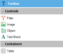
A Dashboard Layout is composed of different kind of widgets available on the toolbar. The available options are:
- Filter
- Image
- Object
- TextBlock
- Table
Its function is to filter the data in the dashboard remaining widgets. All the filters in the dashboard are global in a sense they broadcast its value to every widget in the dashboard. It's the definition of the widget that determines if a filter on the screen is accepted as a widget parameter or ignored. All filtering is done taking into account its name. So, if you have a filter name called "CustomerId"; when changing its value, all queries with a parameter matching "CustomerId" will be updated.
The most important properties are:
- Control name: name assigned to the control.
- Name: filter name to be used in query widgets.
- Visible: Whether the filter is visible or not (boolean). It is useful if you want to leave a filter with a fixed value and it cannot be changed.
- Caption: text to be displayed.
- Data type: filter data type (enumerated: numeric without decimals, numeric with decimals, boolean, character, date or datetime).
- Control Group
- Type: control type (edit, radio button, combo box, drop-down list).
- Dynamic: if possible values are fixed or are calculated by an expression (boolean).
- Values: applies to non-dynamic filters and is a collection of fixed values, you need to set for each item a Name and Value.
The filters may be static or dynamic. When static, the list of possible values must be provided in the filter's definition. When dynamic, you must provide an attribute for the filter values (Item values), another one for the filter value descriptions (Item descriptions) and the set of conditions that may be necessary to navigate the database in search of the filter possible values. For example; if you have a Brand and Model filters, the condition for Model would be: MakeDsc = &MakeDsc (anywhere in the Dashboard filters are referenced with & + <FilterName>).
Inserts a standard Image object on the layout.
Displays a selector to choose a Query object or Data Provider object. The main properties are:
- Object: referenced query object.
- Type: Visual output type (Card, Chart, PivotTable, or Table); depending on the type of output chosen, the associated properties are the same as in the QueryViewer properties section.
- On item click: Action to be executed when clicking an item (partially implemented!).
Inserts a reduced version of a Text Block control. The main properties are:
- Frame: to define if the filter has a frame.
- Caption: text to be displayed.
The properties include the caption of the text and it may reference any filter in the dashboard, for example, "List of &CustomerName orders:"
Inserts a reduced version of a Table control to organize and position other widgets.
The following standard variables are supported