The GeneXus User Control object allows for the extensibility of functionalities that are not available in GeneXus.
You can create a User Control object through the New object dialog (it is inside the Extensibility group).
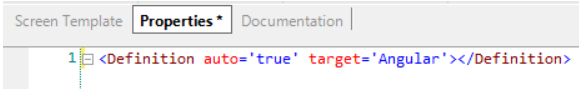
The object is created empty except for a line shown in the Properties tab:
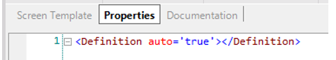
The auto definition allows you to indicate whether to maintain the dynamism between the Screen Template and the Properties. If auto is set to ‘true’, when you add a property in the Screen Template, its corresponding entry in the Properties section will be automatically created.
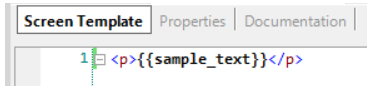
For example, if you create a ‘<p>’ HTML tag in the Screen Template tab with a text property...
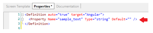
...and auto = ‘true’, the entry will automatically be generated in the Properties tab:
When you want to have full control over the code that is written in the User Control, you can turn off this dynamic mechanism by setting the value ‘false’ for the auto definition.
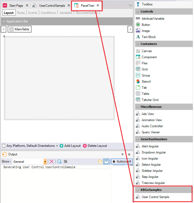
To indicate that you want to use the User Control with the Angular generator (in Panel objects) you must add the target definition as shown:
Once you save the changes, you can see how the User Control becomes available to be used in Panel objects (see toolbox):
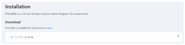
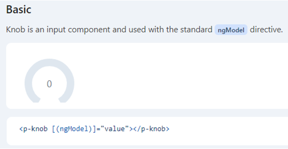
Suppose you want to use the PrimeNG Knob component in your Knowledge Base. By default, GeneXus does not include this control in its control suite, so you will have to integrate it with a User Control. In the official documentation of the control, you can see its requirements and how to use it.
Info: https://primeng.org/knob
Step 1
First, create an empty User Control object and add the definition Target = ‘Angular’ in its Properties tab.
Step 2
Look at the requirements/dependencies that the control needs to work and add them to the User Control.
In the documentation, you can see the following:
Therefore, in the Properties tab of the User Control object you must indicate the dependency, in this way:
<Dependency name="primeng"/>
You might also want to install a specific version of the dependency (due to compatibility issues, for example, between your version of Angular and the control) for which you can also specify the version number. In this case, you will install the primeng version that is compatible with Angular 16 (version used in GeneXus 18 Upgrade 4) as shown below:
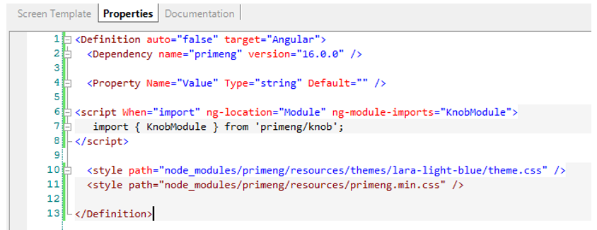
<Dependency name="primeng" version="16.0.0"/>
After specifying the dependencies to be installed in the generated project, you must indicate the Angular generator to make the corresponding imports in the code, both of the packages and of the modules if necessary.
The imports will have a syntax similar to the following:
import { Component } from “package-name”;
Inside the Properties tab of the User Control object, you must specify it this way:
<script When="import" ng-location="Module" ng-module-imports="KnobModule">
   import { KnobModule } from "primeng/knob";
</script>
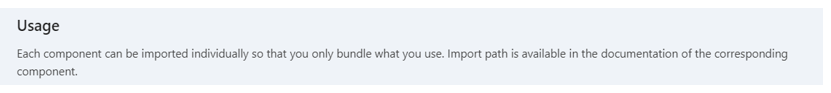
In this example, it is also required to import the “KnobModule”, as specified in the documentation:
Therefore, the following statements are added:
ng-location = “Module” and ng-module-imports=”KnobModule”.
Step 3
Now, go to the Screen Template tab. There, you must first include the following:
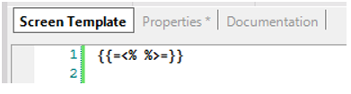
Templates are written inside Moustache markup. The problem is that the substitution markers of Moustache and Angular elements are the same; therefore, this instruction replaces those of Moustache so that instead of being like this: {{ }} they are like this: <% %>. This allows you to write Angular without it being understood as Moustache.
Step 4
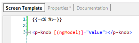
Add the code for the Knob control, as mentioned in the official documentation:
You must add it as follows:
Step 5
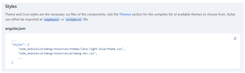
The only thing left to do is to include the styles that will give shape to the control on the screen.
Therefore, in the Properties tab of the User Control object you must include these styles as shown below:
<style path="node_modules/primeng/resources/themes/lara-light-blue/theme.css" />
<style path="node_modules/primeng/resources/primeng.min.css" />
It is also indicated in the documentation:
In short, this is how the finished User Control will be defined:
Step 6
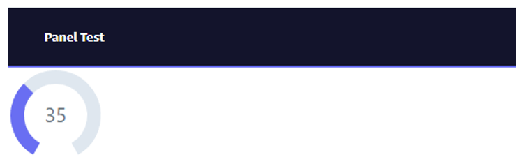
The last step consists of using the User Control in a Panel object.
Simply drag the control from the toolbox to the Panel Layout and, for the particular case of this control, set a value for the “Value” property:
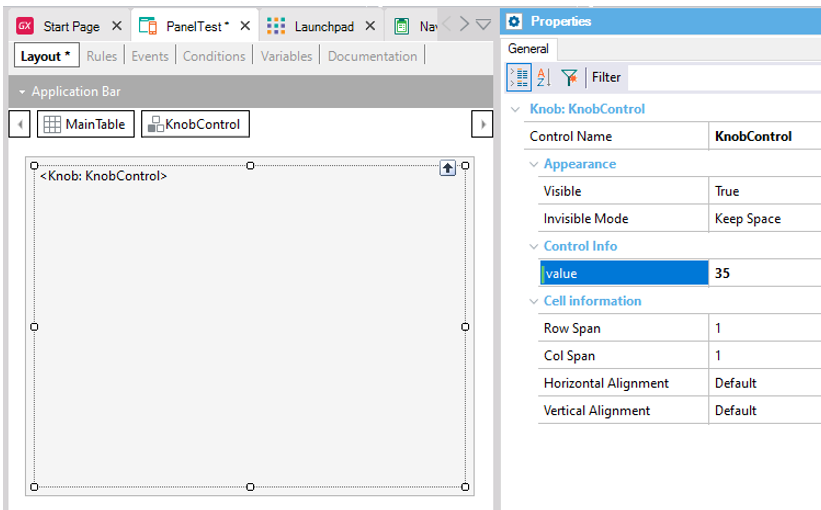
Finally, run it and you will see the control drawn on the screen: