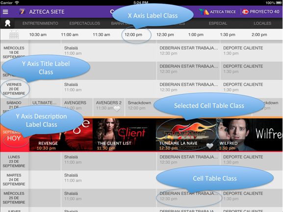
The visual configuration of the Matrix Grid Control is set from this specific classes in the theme.
The class property in the Appearance section indicates the class associated with the control.

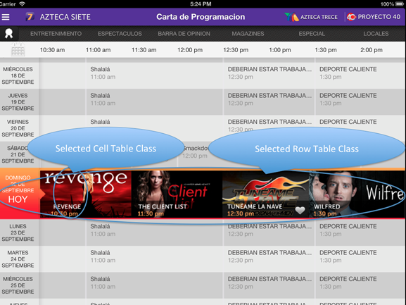
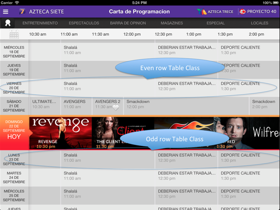
The images show the appearance of the control based on the values set in the properties.
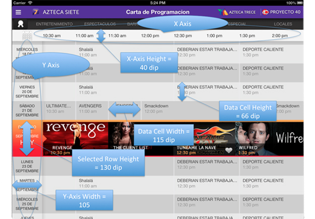 |
| Property |
Value |
| X-Axis Height |
40 dip |
| Y-Axis Width |
105 dip |
| Data Cell Height |
66 dip |
| Selected Row Height |
130 dip |
| Data Cell Width |
115 dip |
|
 |
| Property |
|
Selected Row Table Class
- Background Image: Orange Image
|
|
Selected Row Cell Table Class
- Background Image: Orange Image
- Padding Top: 5 dip
- Padding Bottom: 5 dip
|
|
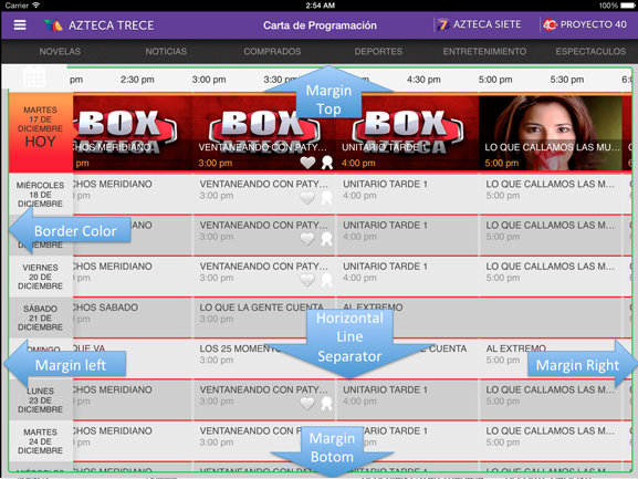 |
| Property |
Value |
| Margin top |
5 dip |
| Margin Bottom |
5 dip |
| Margin Right |
10 dip |
| Margin Left |
10 dip |
| Horizontal Line Separator |
Red Line |
| Border Style |
Solid |
| Border Color |
Green |
| Border Width |
2 dip |
| Border Radius |
5 dip |
|