Controls the alignment along the main-axis.
| Center | Controls are positioned at the center of the container |
| Flex End | Controls are positioned at the end of the container |
| Flex Start | Default value. Controls are positioned at the beginning of the container |
| Space Around | Controls are positioned with space before, between, and after the lines |
| Space Between | Controls are positioned with space between the lines |
Specifies how flex controls are aligned along the main-axis of the flex container (layout or grid) after any flexible lengths and auto margins are resolved.
The following examples have as main-axis the row (column axis is analogous).
| Flex Start value |
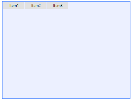 |
| |
| Flex End value |
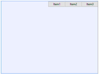 |
| |
| Center value |
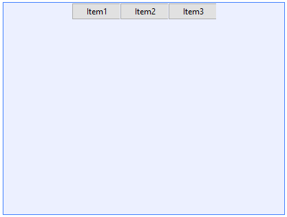 |
| |
| Space Between value |
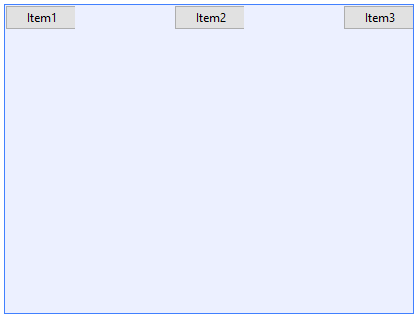 |
| |
| Space Around value |
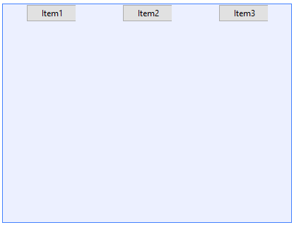 |
Possible options for setting the JustifyContent property at runtime.
| Center |
Justify center. |
| FlexEnd |
Justify at the end. |
| FlexStart |
Justify at the start. |
| SpaceAround |
Justify content before, after and between items. |
| SpaceBetween |
Justify with a space between items. |
- When using Flex Layout, in order to appreciate an effect of this property, Max Width/Max Height properties must be set, or Flex Grow property must be off (0 value) with Width/Height already set, depending on the main-axis value (row/column respectively).
Why naming flex-start and flex-end values instead of left and right?
Because naming left and right we are assuming that the layout is always from left to right, and there are devices supporting right to left layouts.
This property applies both at run-time and at design-time.
This property is available since GeneXus 15 upgrade 12.
Platforms: Web(.Net, Java), Smart Devices(Android, IOS)
Controls: Grid, Table