Controls the alignment along the cross axis.
| Baseline | Controls are aligned such as their baselines align. This is useful to have several texts from diferents controls aligned taking into account different font sizes. |
| Center | Controls are positioned at the center of the container. |
| Flex End | Controls are positioned at the end of the container. |
| Flex Start | Controls are positioned at the beginning of the container. |
| Stretch | Default value. Controls are stretched to fit the container. In other words, children match the size of their container in the cross axis. |
Describes how to align children along the cross axis of their container.
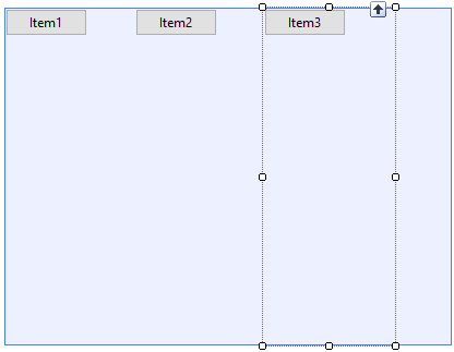
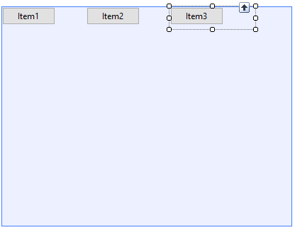
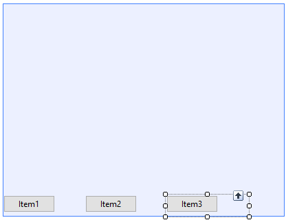
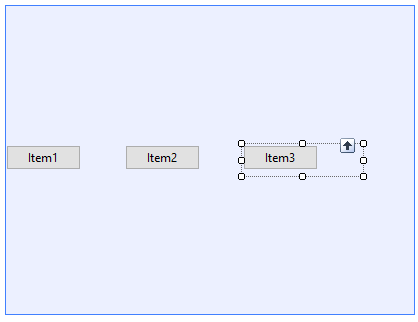
The following examples have as main-axis the row (column axis is analogous) and wrap the content.
| Stretch value |
 |
| |
| Flex Start value |
 |
| |
| Flex End value |
 |
| |
| Center value |
 |
| |
| Baseline value |
| Not represented in the panel designer. |
Possible options for setting the AlignItems property at runtime.
| Baseline |
Align at the baseline. |
| Center |
Align at the center. |
| FlexEnd |
Align at the end. |
| FlexStart |
Align at the start. |
| Stretch |
Stretch controls to fit the container. |
- Any other value different from 'Stretch' for this property requires that the children controls have a non-default value for the Width/Height property depending on which is the cross-axis (if the main axis is 'row', it requires height; but if the main axis is 'column', it requires width)
- This property does not have any effect with Flex Grid in iOS.
This property applies both at run-time and at design-time.
This property is available since GeneXus 15 upgrade 12.
Platforms: Web(.Net, Java), Smart Devices(Android, IOS)
Controls: Grid, Table