Indicates how much the content can be expanded.
| Background Only |
Default value. The container control will expand only its background, not its content. Embedded controls can be expanded and allow scroll on them (if the control admits it). |
| Background & Content |
The container control will expand both background and content, allowing embedded controls be positioned on the expanded area. |
| None |
The container control won't be expanded. This value disables Expand Bounds Directions property and Expand Bounds Limit property. |
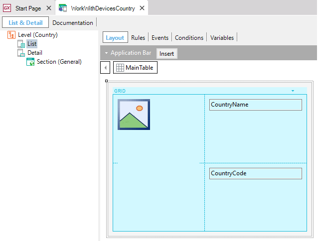
Let's analyze the behavior in each case running a simple app on an iPhone X, focused on landscape mode where unsafe areas (green color) appear on both sides of the screen (because of the presence of the notch). Suppose we've got a WorkWithDevicesCountry object whose List node is defined as the following image. We'll display the effect of varying Expand Bounds property for the Main Table on the layout.

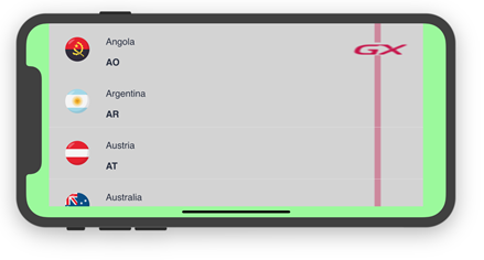
The control is not expanded and remains in the safe area of the screen.

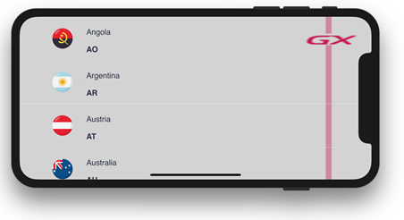
The background of the control (Main Table) is expanded beyond the unsafe area but not its content (Grid's rows content ).
This fact is evidenced by remaining the original padding on both sides on the screen (appreciable only on the left, but also it's on the right) only respect the flag icon.

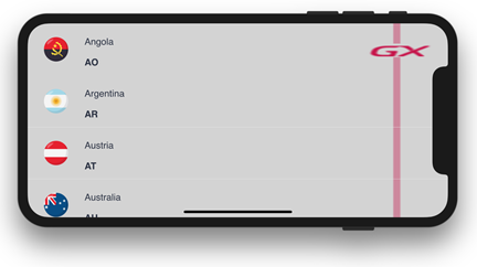
The background of the control (Main Table) and its content (Grid's rows content) are expanded beyond the unsafe area.
This fact is evidenced by the absence of paddings.

This property applies only at design-time.
Controls: Grid control, Tab control, Canvas control, Table control
Platforms: Smart Devices(IOS)
This property is available as of GeneXus 15 Upgrade 8