With the Fiori for Web Pattern comes a Web Panel object called FioriLauchpad that provides a simple and easy way to keep your objects organized using tiles.
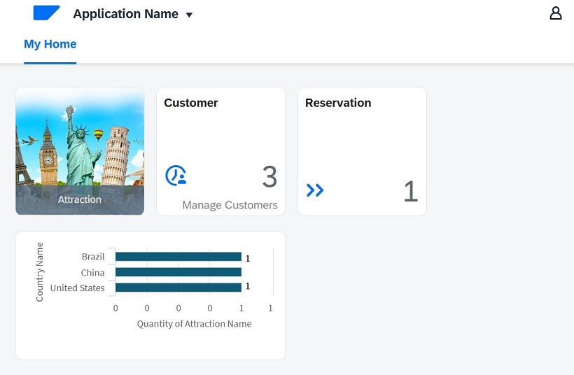
The FioriLauchpad Web Panel object calls the ListFioriPrograms Procedure object to load the tiles.
The data returned by the ListFioriProgram Procedure for each tile is shown in the image below:
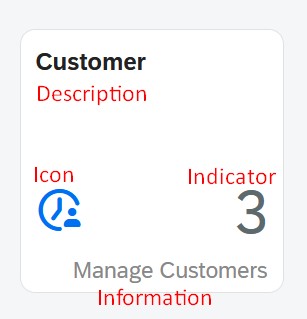
This tile shown above provides you with a link to work with Customers. It indicates the quantity of the registered Customers available.
You can customize each tile by setting its properties. The properties available to be set can be found under the corresponding pattern instance of the linked object and appear only if the Include in Launchpad property is set to True.
There are three kinds of Tiles:
- Information Tile:
This is the default tile. It is a plain white tile that displays information regarding the associated Transaction object or Panel object.
- Image Tile:
This tile has a background image and a label with information.

The parts of the tile you can modify (and if the update implies to set properties, they are mentioned) are described below:
- The description:
It can be modified by editing the Description property on the pattern tab.
- A link to the object.
- The icon for the tile:
An icon is set by default. You can set another icon to show by editing the Tile Icon Unicode property and selecting one from the SAP Icon Explorer.
- The tile indicator:
By default, it shows how many records (count) associated with the object are available. You can choose if you want to use it, change its definition or not using it at all, by setting the Tile Indicator property offered by the pattern. If you leave it blank, you mean that you don't want to show it.
- The Tile information:
It is used to give an extra description for your tile. By default, it is empty. You have to set the Tile Information property to update it.
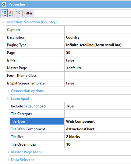
- The tile Size:
It determines your tile size. It can be simple One Block or Two Blocks.
- The Tile Type:
It sets the kind of tile to be used.
- The Tile Image (Only for Image Tile Type):
It sets the image to be used as the background of the tile.
- The Tile Web Component (Only for Web Component Tile Type):
It sets the component to be used by the tile. To make the Web Component fit the tile, you need to set the Web Component width to 350px and height 130px (for a Two Block sized tile).
- The Tile Category:
It allows you to organize your launchpad into categories. You can create one just by writing its name. If no categories exist, the combo box will be empty. The Order Index set will still be used inside the category.
To select if you want to display an object on the Launchpad or not, you can use the Include In Launchpad property on the pattern tab.
If you want to add objects, you need to edit the ListFioriPrograms Procedure. To do this, you have to open the Procedure. Once being in the source section, you have to copy one of the tile's code. Then paste it outside of the code generated by GeneXus (to prevent it from being overwritten by GeneXus). Finally, don't forget to edit the pasted code to call the object you want to add.
/* Generated by GeneXus Fiori Pattern [Start] - Do not change */
...
/* Generated by GeneXus Fiori Pattern [End] - Do not change */
&name = !"SalesOrderListReport"
&description = "Sales Order"
&link = SalesOrderListReport.Link()
&TileType = TileType.Information
&TileSize = TileSize.TwoBlocks
&iconUnicode = !""
&information = ""
&Count = 0
For Each SalesOrder
       &Count += 1
EndFor
&indicator = trim(&Count.ToFormattedString())
&sessionKey = !"SalesOrderListReportGridState"
&orderIndex = 0
Do 'AddProgram'
&name = !"ProductListReport"
&description = "Product"
&link = ProductListReport.Link()
&TileType = TileType.Image
&TileSize = TileSize.TwoBlocks
&information = comics.Link()
&sessionKey = !"ProductListReportGridState"
&orderIndex = 0
Do 'AddProgram'
&name = !"CustomerListReport"
&description = "Customer"
&link = CustomerListReport.Link()
&TileType = TileType.WebComponent
&TileSize = TileSize.TwoBlocks
&information = "CustomerGeneral"
&sessionKey = !"CustomerListReportGridState"
&orderIndex = 0
Do 'AddProgram'
To customize the title of your Launchpad, open the FioriLaunchpad Web Panel and go to the Events section.
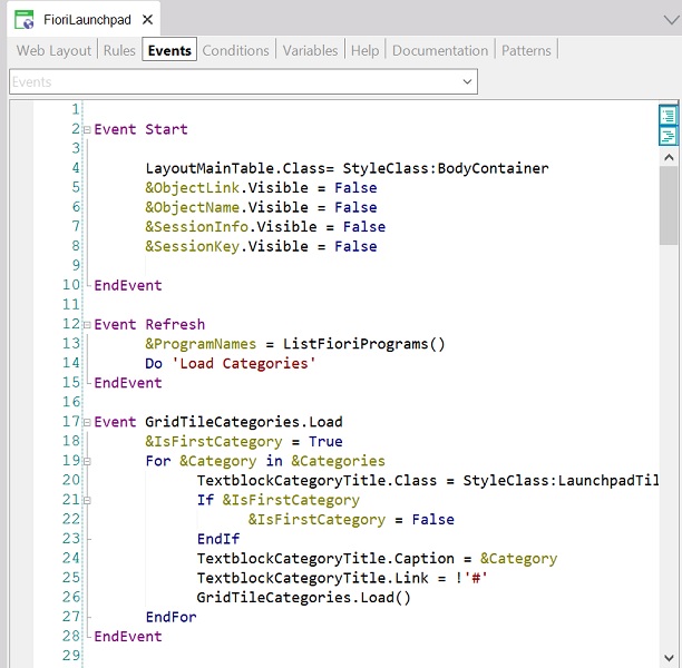
Lastly, add the code below to the Start Event:
AppHeader.Caption = <Insert the new title here>
To create your own customized Launchpad, follow the next steps:
- Make a copy of the FioriLaunchpad Web Panel and the ListFioriPrograms Procedure, by saving and renaming them.
- Modify your customized Launchpad to make it look like you want to. To modify the tiles you want to load, there are two ways to do it:
- From the grid load event on the Web Panel, you can add a filter to select which tiles you want to add.
- From the customized ListFioriPrograms you can add/delete/modify tiles.
- If you want your customized Launchpad to be organized into different sections, you have to make a copy of the existing grid on your web form and create a new Load event to customize the tiles to be added to this new grid (remember to rename everything on this new grid and to hide the variable's grid). In order to make the tiles fully functional, you also need to create the click events for them (you only have to copy the click event for the original tiles and update it to use the new variables).