GeneXus counts with a module called GeneXus SAPUI5. It's dynamic and incremental, with GeneXus controls based on User Control 2.0 and SAP UI5 technology. Additionally, there's a guide for any GeneXus developer to implement their own UC 2.0 based on SAP UI5 if the one you want to use is not in this module yet.
What has enabled this approach was the GeneXus implementation of the User Controls 2.0 and the announcement, in 2019, of the release of the UI5 Web Components. The union of these two realities allows us to provide a solution to the issue of incorporating SAP controls UI5 in GeneXus developments.
So what are the UI5 Web Components?
The UI5 Web Components are the new offering of UI5 to provide a set of reusable UI elements to that can be used for your static websites or web applications using any web framework of your choice with a minimalistic footprint. They allow you to create a consistent user experience aligned with the SAP Fiori Design Guidelines and incorporate the Fiori 3 design.
The following controls are within this module. You can download them from here in an XPZ format and start using them now:
1. First, look for the list of SAP UI5 controls that you want to incorporate into the GeneXus development.
As an example, let's work with a simple case, choose BusyIndicator. There are several options for this control, let's work with the option 'Busy Indicator with different size'.

2. The necessary tags for this control are the following:
<div>
   <ui5-busyindicator active size="Small"></ui5-busyindicator>
   <ui5-busyindicator active size="Medium"></ui5-busyindicator>
   <ui5-busyindicator active size="Large"></ui5-busyindicator>
</div>
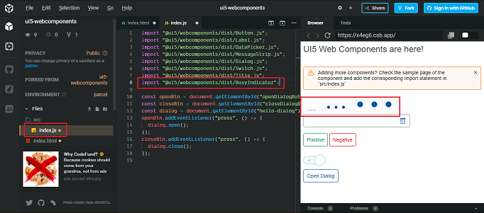
To test the behavior of the control, you can use a code editor such as CodeSandbox (specifically)
Upon entering, there are two files of interest on the left: (1) index.js and index.html. If you copy the tags of the control you want to use in index.html (2), you will see it appear in the left panel (3).
In case of not seeing it, it is because some js in index.js need to be included. If this is the case, return to the page where the control is located (UI5 Web Components), and you will find what the import that you should include in the index.js file is, indicated in Overview / ES6 Module Import. In this case, import "@ ui5 / webcomponents / dist / BusyIndicator";
Paste that import into the index.js file and then you will see the control as it will be seen on the page.
With this, you have the necessary knowledge to perform your UC in GeneXus.
3. To create your UC in GeneXus, select New Object / Extensibility / User Control. In this case, the control will be named UI5BusyIndicator. As the documentation indicates, you must include the HTML code provided by the designer or the CSS Framework in the Screen Template tab. Additionally, you can replace the static data with Properties to which you give a name, replacing the hard-coded by that name between {{}} to boost the UC.
Here, instead of leaving three tags, each one with its corresponding Size (Smal / Medium / Large), there's only one that replaces the hard-coded sizes with a property and its name (e.g. "Size")
<ui5-busyindicator active size="{{Size:Small|Medium|Large=Medium}}"></ui5-busyindicator>
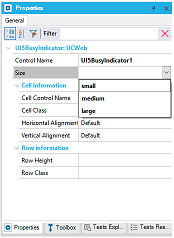
Once this is done, the type, default value, etc. for the property / properties can be indicated in the tab Properties of the UC.
In this case, as there are three possible values for the Size, the Screen template will be defined as follows:
<ui5-busyindicator active size = "{{Size:Small|Medium|Large=Medium}}"> </ui5-busyindicator>
4. The Base Library (composed of external CSS & JS & Assests files) must be included. This comprises, among other things, the amounts of SAP UI5 such as the one shown in point 2.
To do this, the GeneXusSAPUI5.gxlibrary file must be included as a File in the KB (which will be named GeneXusSAPUI5_gxlibrary).
This newly added file (GeneXusSAPUI5) must be placed in the UC Property Base Style you defined.
(in case you need to add an import that is not yet in the provided GeneXusSAPUI5.gxlibrary, see here how to add it)
5. From here you can incorporate the UC into any GeneXus object.
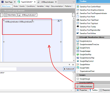
When executing the web panel, you will see the control
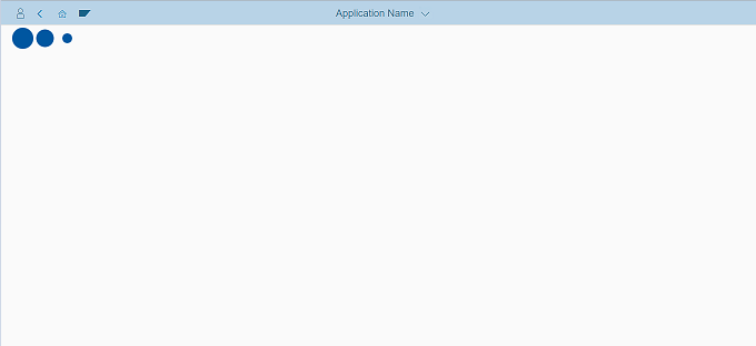
For example, If a Web Panel is defined, you will find the UC at the end of the Toolbox. In this case, you will see the UI5BusyIndicator, when dragging it on the form. If you select it, you will see the one that you put as dynamic (in this case Size) among its properties.