Attribute-Radiobutton is a class that inherits properties from the Attribute class, but applies specifically to controls whose Control Type property = Radio Button.
When generating the Work With pattern, this class allows those Attributes whose Control Type property = Radio Button to be automatically assigned this specific class.
First, create an Attribute class in the Styles section of your Design System Object with the desired general style for the attributes:
        .Attribute {
            gx-label-class: attribute__label;
             border-style: solid;
             border-color: #8592A6;
             border-width: 1dip;
             border-radius: 4dip;
             margin-left: 16dip;
             margin-right: 16dip;
             margin-bottom: 8dip;
             background-color: $colors.surface;
             padding-left: 8dip;
             padding-right: 8dip;
             gx-show-edit-text-line: false;
             color: #3D4854;
             gx-invite-message-color: #8592A6;
             font-size: 16dip;
             font-family: $fonts.primary-regular;
       }
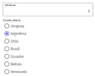
Now, suppose that if the Attribute/Variable is a Radio Button, you want the borders not to be displayed and the left padding to be 0, as shown below:
The class to be defined is as follows:
        .attribute-radiobutton {
            @include Attribute;
            border-style: none;
            padding-left: 0dip;
        }
Design System Class