They specify features such as color, background, borders, size, margins, padding, fonts, links, positioning, alignment, and many others that can be applied to screen controls in any platform (Web, Angular, Android, Apple). They are also used to configure rule settings such as Font-face style rule.
These properties can be set using the Properties Editor as detailed in HowTo: Configure Design System Class Properties. You can also write them following the syntax below.
<property_name> ':' {value[unit] | $token_group.token_name | gx-function( gx_object )}... ';'
View Design System Syntax conventions.
Where:
property_name
Valid style property name. Valid properties are both the existing ones for Web platform objects (for example, Web Panel) and for Native or Angular (for example, Panel).
value
Valid value for the property_name.
unit
Valid unit of measurement according to property_name. Some of them are px, dip, em, %.
$token_group
Valid Token category. In the Token editor, you can see a combo box with all the possible values (colors, radius, spacing, etc.).
token_name
Name of the Token defined under the token_group category in the Tokens section of the Design System Object or of a DSO (or Tokens section of a DSO) imported by it (in a sort of "extended DSO" if viewed as an analogy to the concept of extended table).
gx-function
Function used to return a reference to a KB object as a value. For example, the gx-image function returns a reference to a KB image and is used for properties specifying images. The gx-file function returns a reference to a KB file.
gx_object
KB object referenced by the GX-function. It is of Image type if the function is gx-image and of file type if the function is gx-file.
tokens myTokens
{
       #colors
       {
               Highlight: #D89722;
       }
       #spacing
       {
               s: 15px;
       }
}

styles myStyle
{
       .class1
       {
               color: red;
               line-height: 75px;
       }
       .class2
       {
                color: #D82822;
                line-height: 1.8;
       }
       @font-face
       {
                 Font-family: TestFont;
                 src: gx-file(MyFontFile);
       }
       .class3
       {
                 color: $colors.Highlight;
                 font-family: TestFont;
       }
       .class4
       {
                 gx-lottie-file: gx-file(lottieFile);   //Panels only
       }
       .class5
       {
                 margin: 10dip 5dip 15dip 5dip;
                 background-image: gx-image(myImage);
       }
       .class6
       {
                 margin: 10px 5px;
       }
       .class7
       {
                 margin: $spacing.s;
                 border: 5px solid red;
       }
       .class8
       {
                 color: blue;
                 gx-label-class:  class3;
       }
}
As in CSS, some properties accept shorthand notation to combine several properties into one. For example, instead of setting the 4 individual properties margin-top, margin-bottom, margin-left, and margin-right, you can type margin and set all four values inline. Also, if top and bottom and right and left match, they can be set in pairs. If they all match, you can specify a single value.
See, for example, the CSS shorthand border property.
Some properties are valid for rendering both Web Panel and Panel controls, but others are specific to each type (Web Panel or Panel).
For the Web case, all properties valid in CSS will be valid here as well. The reverse is not true because there is a set of GeneXus-specific properties that will provide a higher level of abstraction —along low-code lines— and will be widely used. They start with the prefix "gx-".
Also, unlike in CSS, here Tokens can be referenced instead of typing the values directly.
For native or Angular applications, the properties that do the same thing as in Web apps are usually called in the same way, although in some cases they may differ. Going forward the plan is to move towards standardization.
When a property or its value are meaningless or invalid for rendering a particular control on a particular platform, the definition will be ignored. This is not the case for the other valid properties of the class for that control.
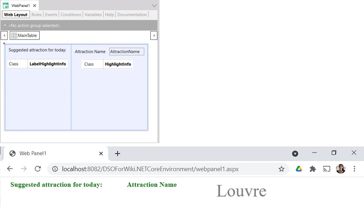
They are GeneXus-specific for that object. For example, suppose you want to set a consistent style to certain Attribute/Variable controls through a HighlightInfo class.
How do you set the style of that control's label, when it is visible? By indicating, in the class, which class specifies the style of the label through the property gx-label-class:
styles MyStyles
{
    .HighlightInfo
    {
        font-family: serif;
        font-size: 60px;
        color: grey;
        gx-label-class: LabelHighlightInfo;
    }
    .LabelHighlightInfo
    {
        color: green;
        font-weight: bold;
    }
}
For example, if you associate the LabelHighlightInfo class with a Text Block and the HighlightInfo class with the Attribute (where for the label you associate the same LabelHighlightInfo class as for the Text Block), see how it looks at runtime:
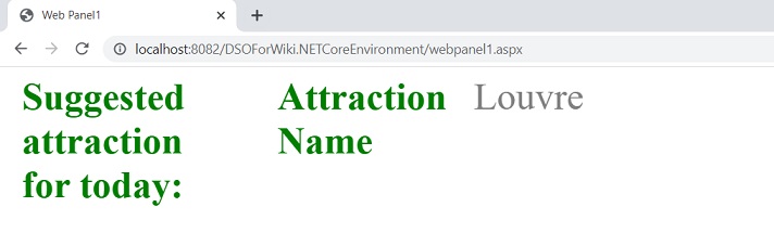
If you want the text of the attribute and the text of the tag to match in all but a few characteristics, you could use the Include style rule:
.HighlightInfo
{
    font-family: serif;
    font-size: 40px;
    color: grey;
    gx-label-class: LabelHighlightInfo;
}

.LabelHighlightInfo
{
     @include HighlightInfo;
     color: green;
     font-weight: bold;
}
Another example: if a Text Block control with caption "CONTACT US TODAY" is associated with the class:
   .MainActionText
    {
        color: $colors.Highlight;  //token Highlight: #D82822;
        font-size: 14px;
        font-family: Rubik-Medium;
        font-weight: 500;
        text-transform: uppercase;
        line-height: 18px;
    }
When running on the web, you will see:

But if the Text Block (whose name is TextBlock1) has a Link property defined, for example, in the Start event:
TextBlock1.Link = ContactUs_web.Link()
At runtime it will look as follows:

Because it is a link, the HTML selection will look for the style of the <a> tag that is used to indicate links and by default is displayed in the typical blue color.
If you want to give it a distinctive style when the class is used for a link, just add the gx-attribute-link-class property and indicate the class that will set the style of the control when it is a link. In the example, it is selected:
.MainActionText
  {
       color: $colors.Highlight;
       font-size: 14px;
       font-family: Rubik-Medium;
       font-weight: 500;
       text-decoration: none;
       text-transform: uppercase;
       line-height: 18px;
       gx-attribute-link-class: MainActionText;
   }
At runtime, it will look as follows:

You could also add a class to change the color when hovering over the Text Block:
   .MainActionText
    {
        color: $colors.Highlight;
        font-size: 14px;
        font-family: Rubik-Medium;
        font-weight: 500;
        text-decoration: none;
        text-transform: uppercase;
        line-height: 18px;
        gx-attribute-link-class: MainActionText;
        gx-attribute-hovered-class: LinkHover;
    }
   .LinkHover
    {
        color: $colors.HighlightNeg; //token HighlightNeg: #D89722
    }
At runtime: