This article is about a design file for a Plant Care mobile font-end with multiple layouts made with the Figma design tool.
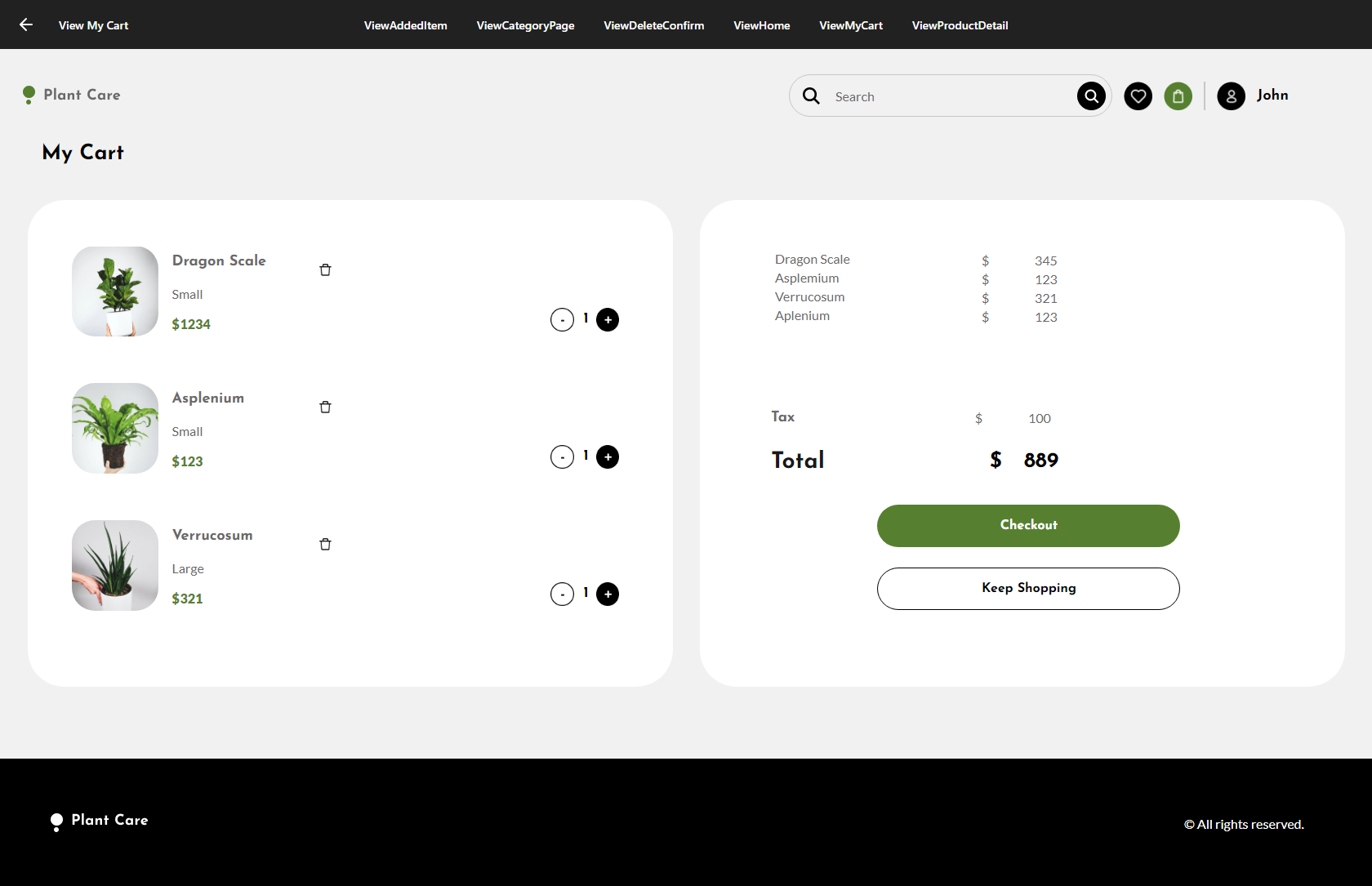
The example presents a multi-experience design for an e-commerce application, including screens for home, product details, cart, add item, delete confirmation, and search results, along with their empty states.
As a multi-experience sample, it comes in Desktop, Tablet, and Phone sizes for each case.
 Plant Care
First, save a local copy to your Figma account as follows:
- Open the Plant Care sample provided (you have a read-only view).
- Click on the "Open in Figma" button. This action will create a copy of the sample in your drafts.
- Next, follow the instructions of HowTo: Export a Figma design with your local copy.
You must follow the instructions described in the Design Import option article.
Once you paste your Figma URL in the File field of the Design Import option, you can start the inspection process by clicking on the Load button (it will ask you for the Figma Token). After processing every file retrieved from Figma, the Design Import dialog will display a preview as follows:
You can inspect every node in the left-side tree. Every type of node will show context information; for example, preview (image and layout tree) and GXML code in case of Panels; only GXML code in case of a Design System for describing tokens and styles; a preview for Images and Fonts, etc. Also, you can select/unselect the nodes depending on whether or not you want to import them.
Warning: When you select/unselect nodes, there is no dependency check between nodes. So, for example, if you unselect a node, make sure there is no dependency with another node (for example, an image used in a panel). Otherwise, some import errors may occur.
Once the import has finished, check the generated panels and how they look. Also, check the tokens/styles in the Design System object, Image objects, and File objects (fonts) imported.
Finally, if you agree with the objects to be generated, you can click on the OK button and start importing the design into the Knowledge Base.
| Designer |
Developer |
| Figma |
Main-Frame |
GeneXus |
Android |
iOS |
Browser |
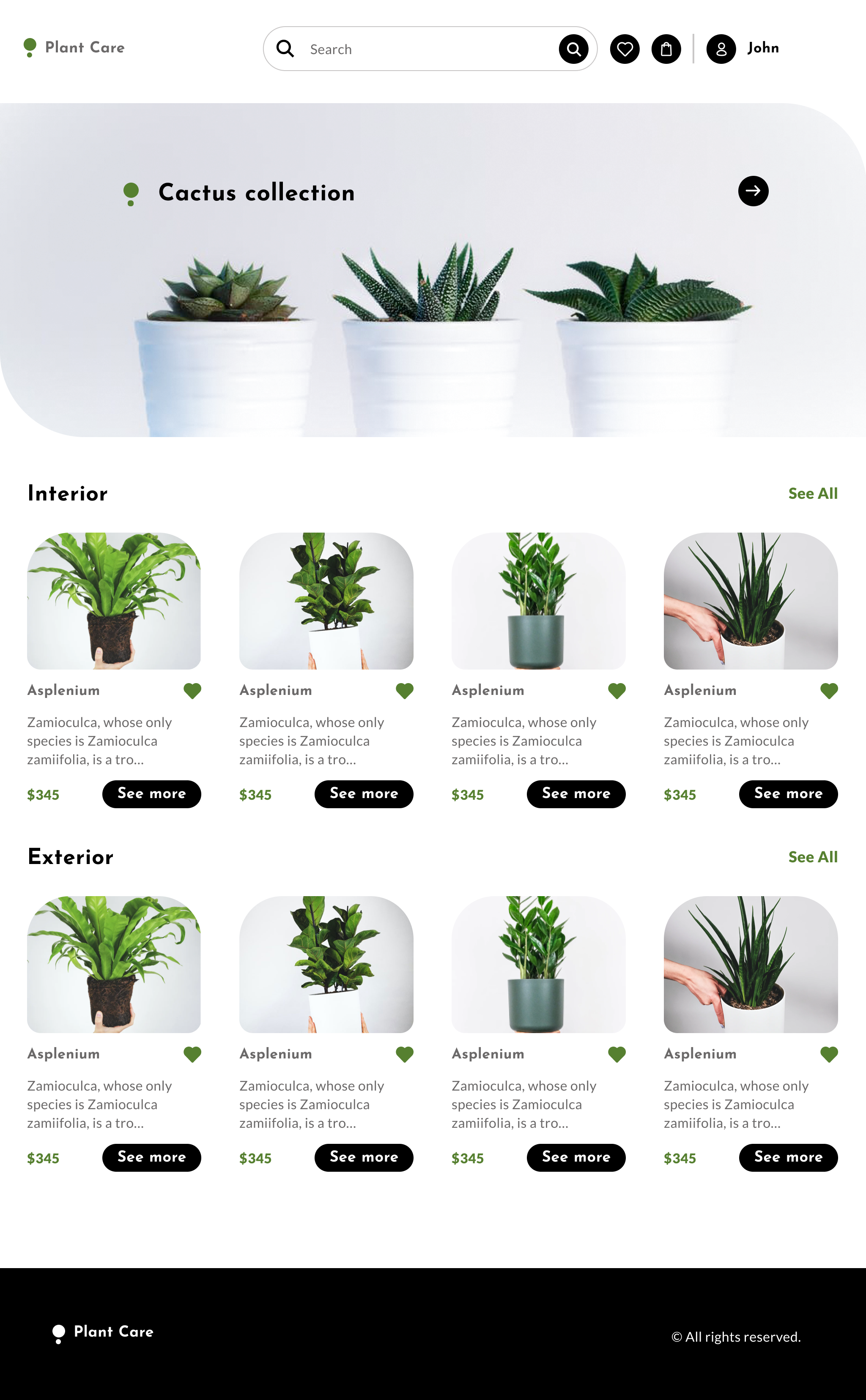
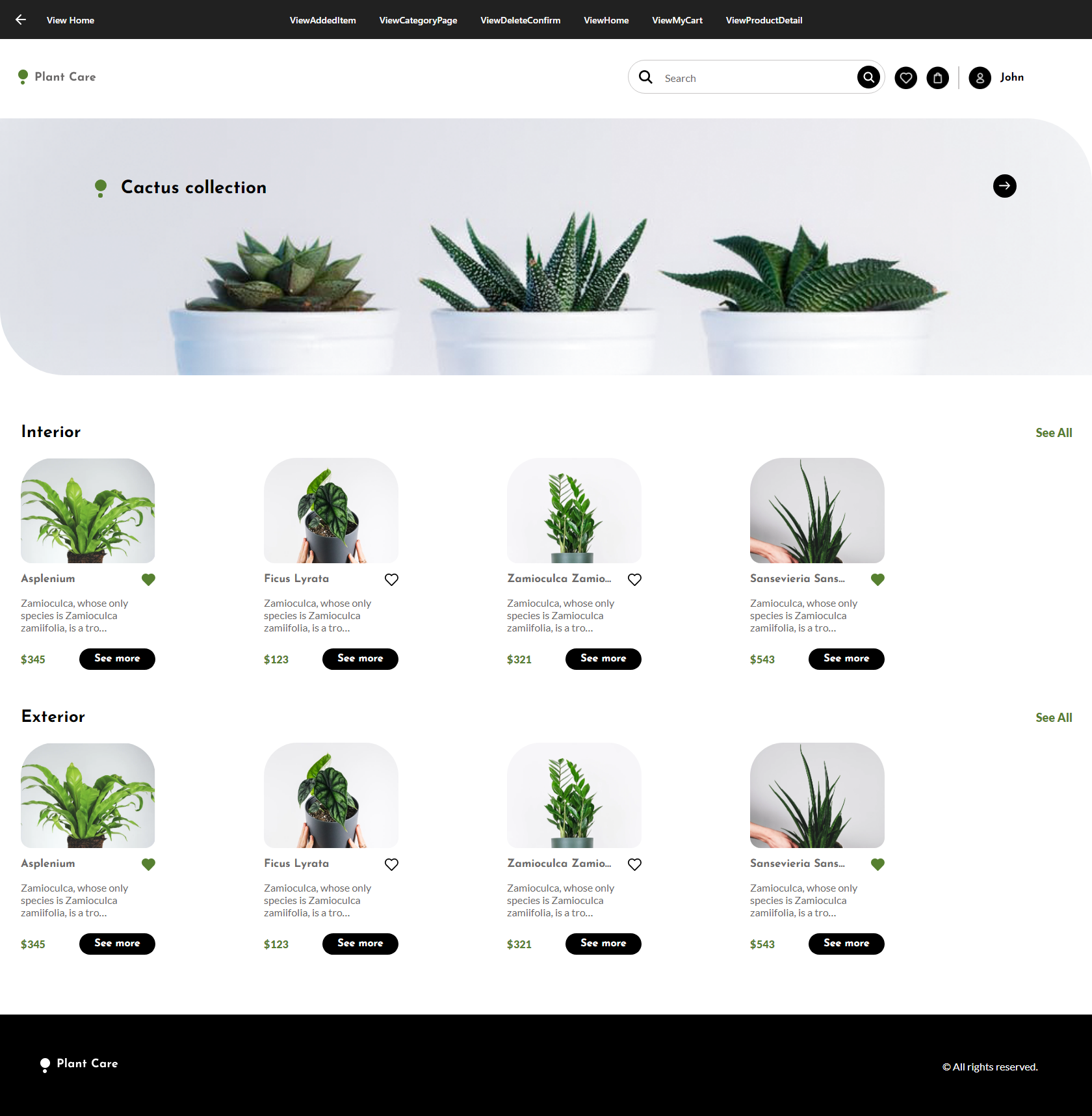
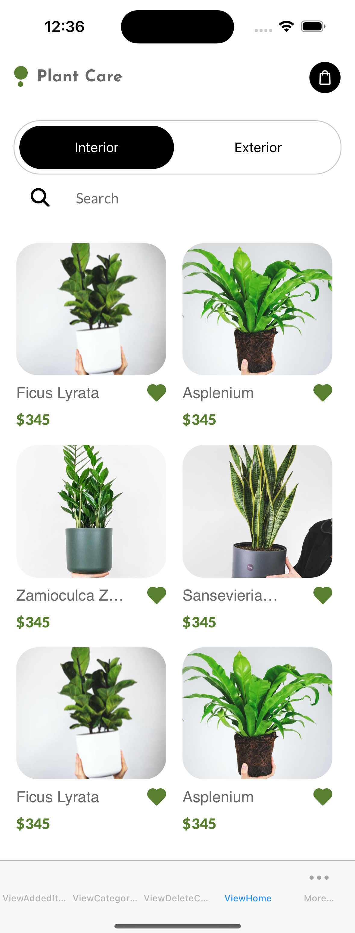
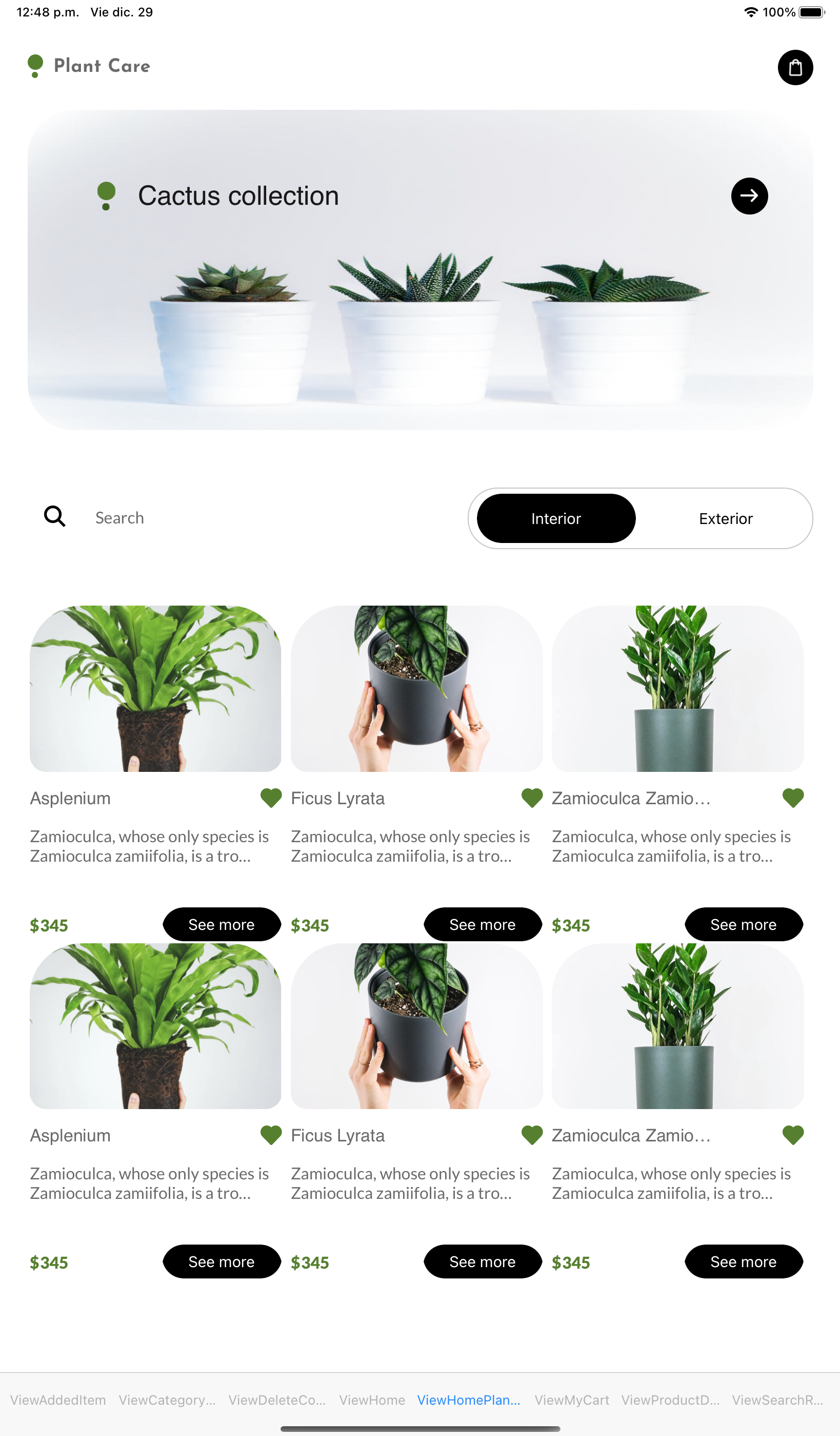
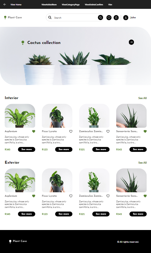
| Home |
 |
ViewHome
(Execution: Desktop) |
N/A |
N/A |
 |
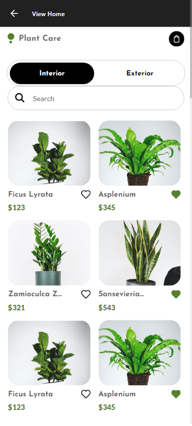
| Home - Phone |
 |
ViewHome
(Execution: Phone) |
 |
 |
 |
| Home - Tablet |
 |
ViewHome
(Execution: Tablet) |
 |
 |
 |
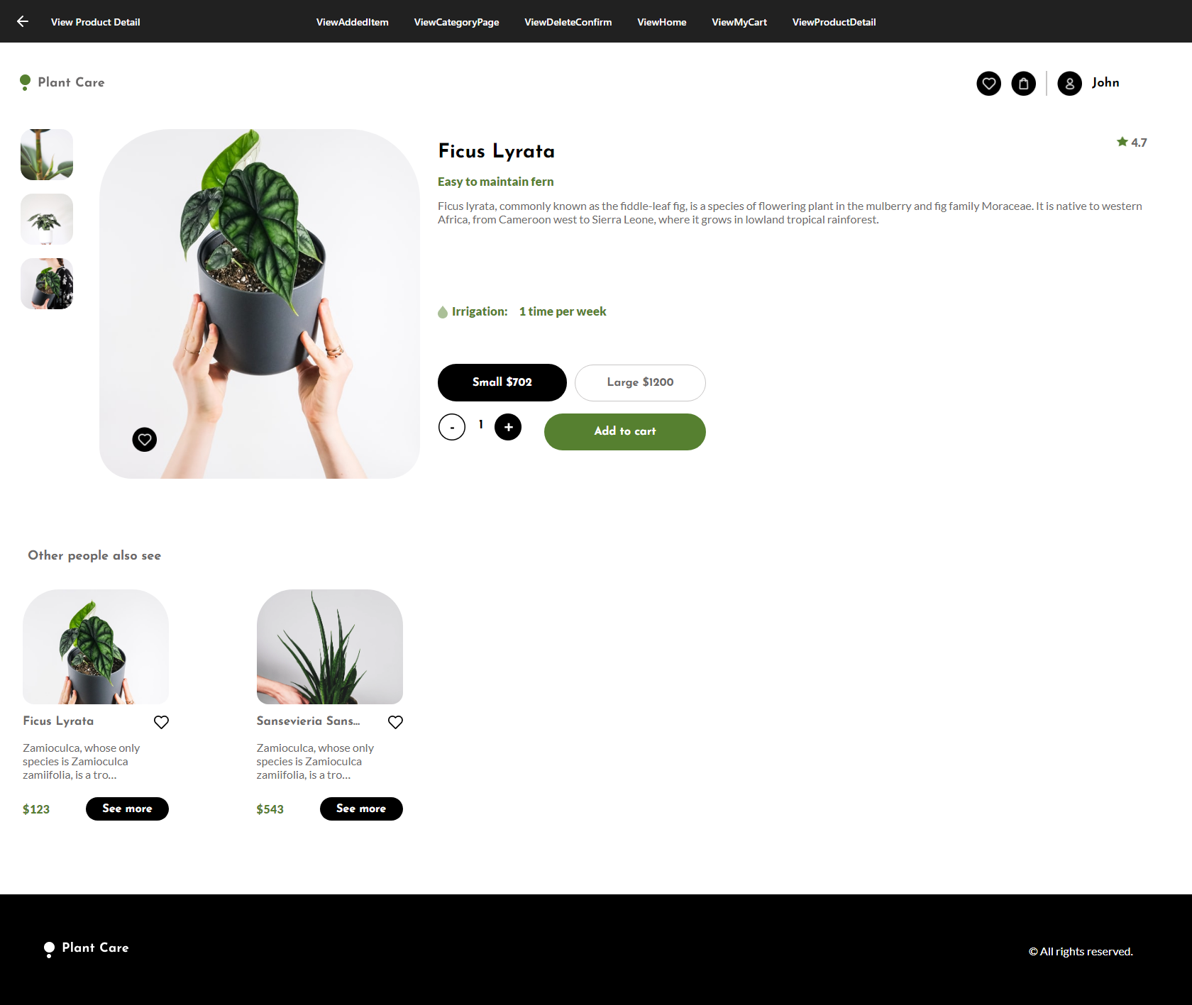
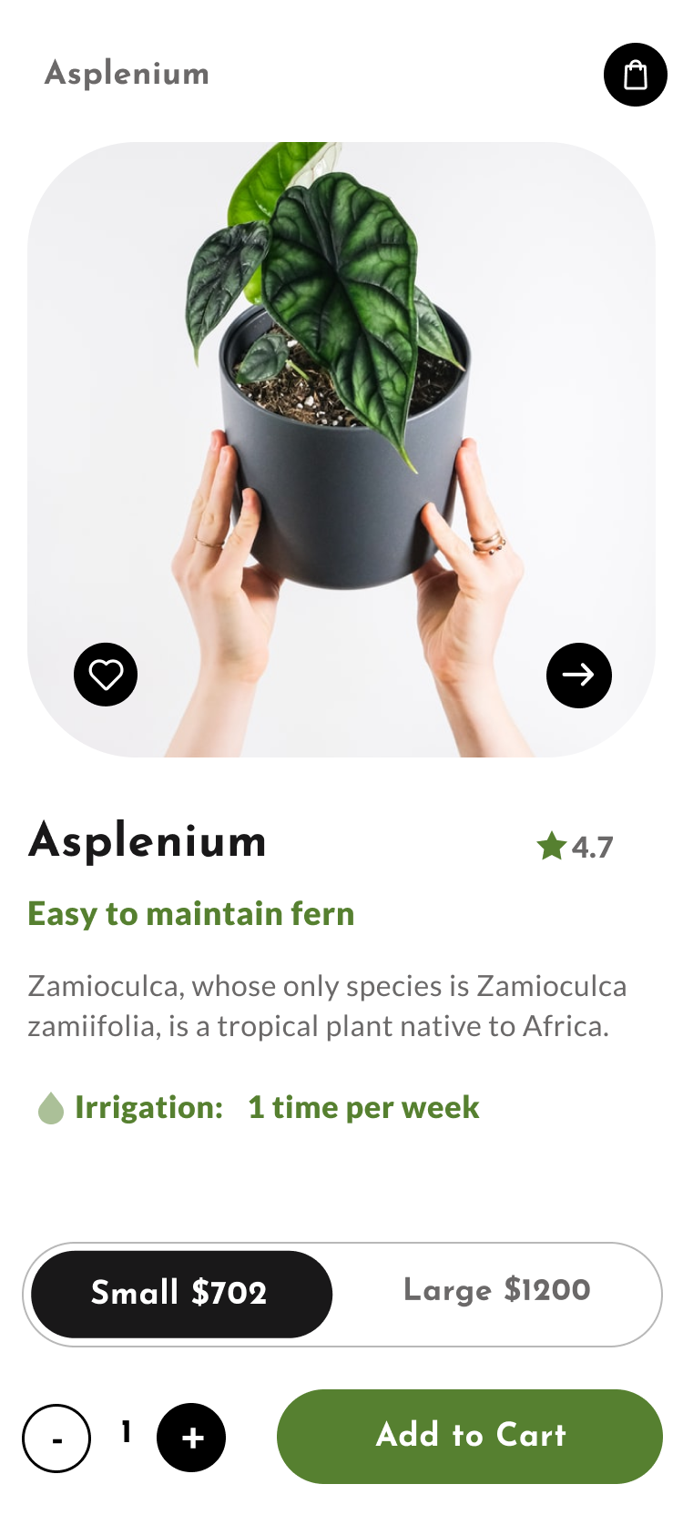
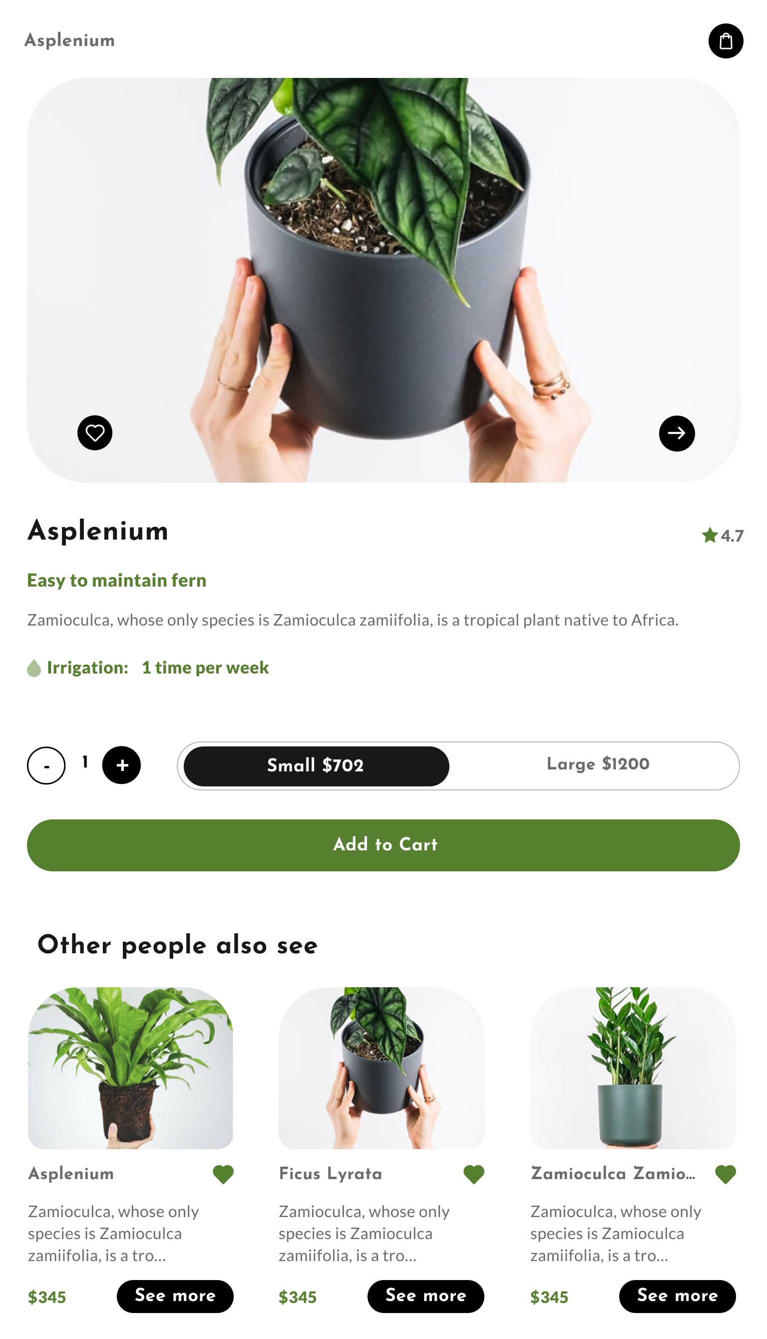
| Product Detail |
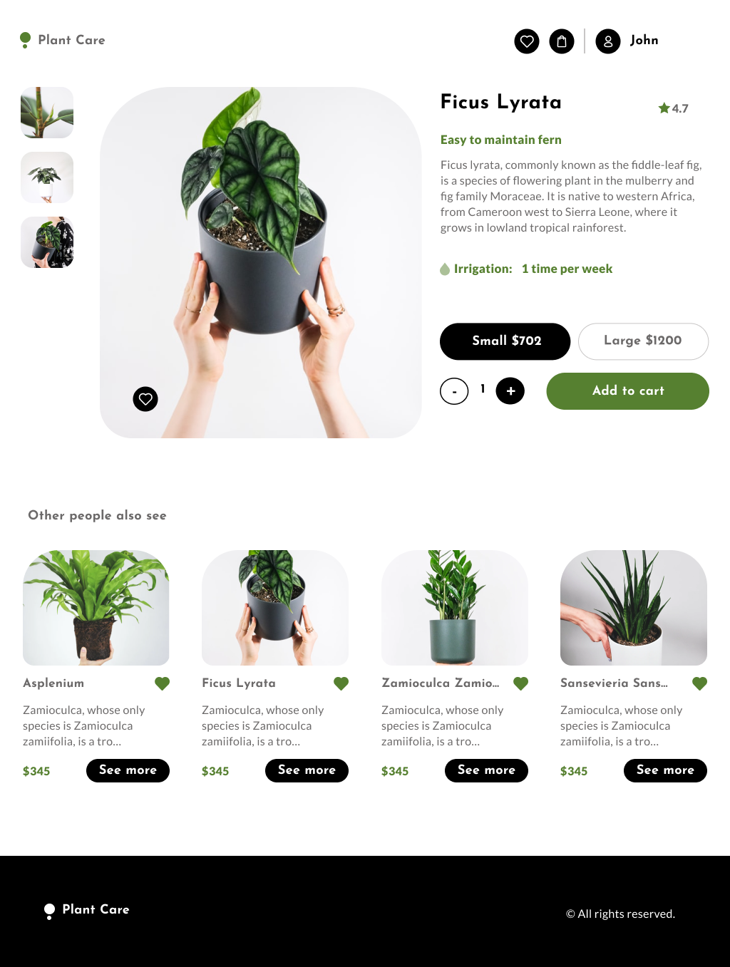 |
ViewProduct Detail
(Execution: Desktop) |
N/A |
N/A |
 |
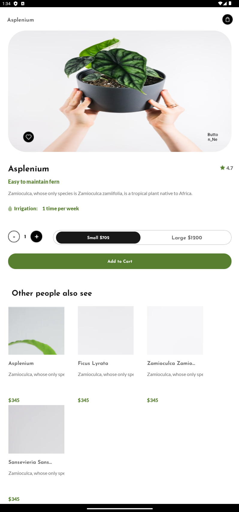
| Product Detail - Phone |
 |
ViewProduct Detail
(Execution: Phone) |
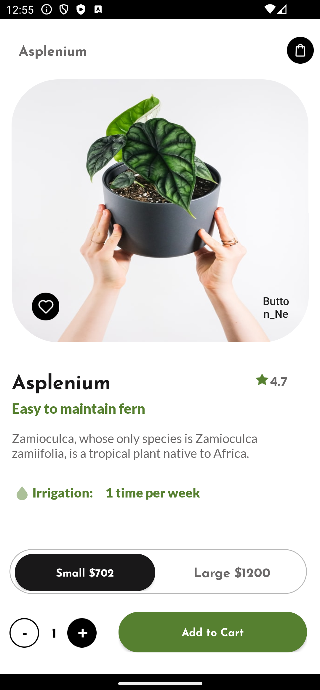 |
 |
 |
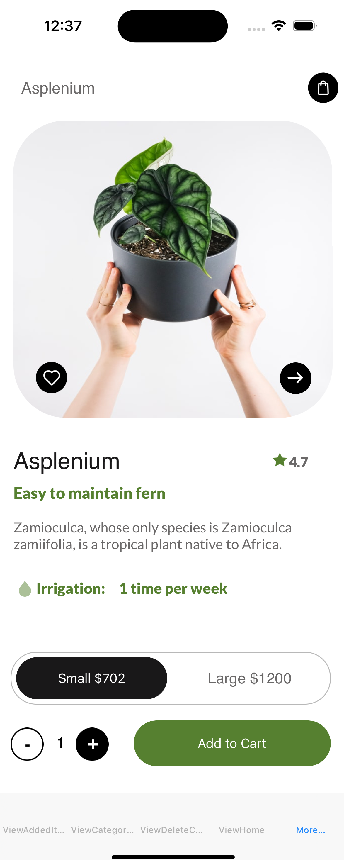
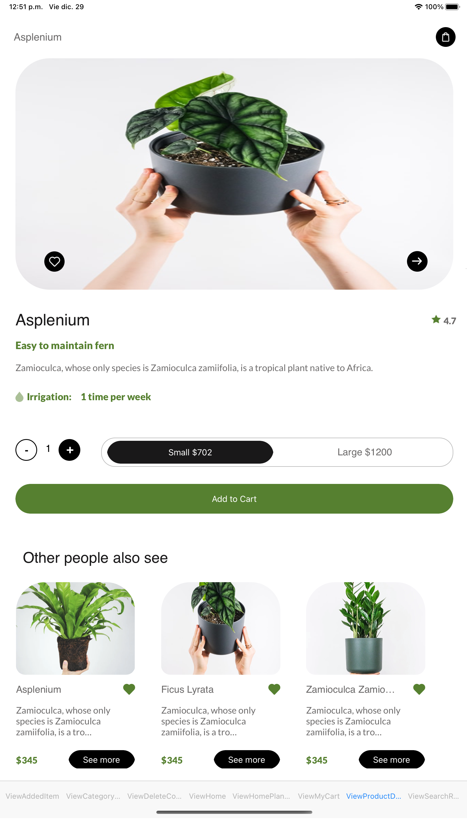
| Product Detail - Tablet |
 |
ViewAProduct Detail
(Execution: Tablet) |
 |
 |
 |
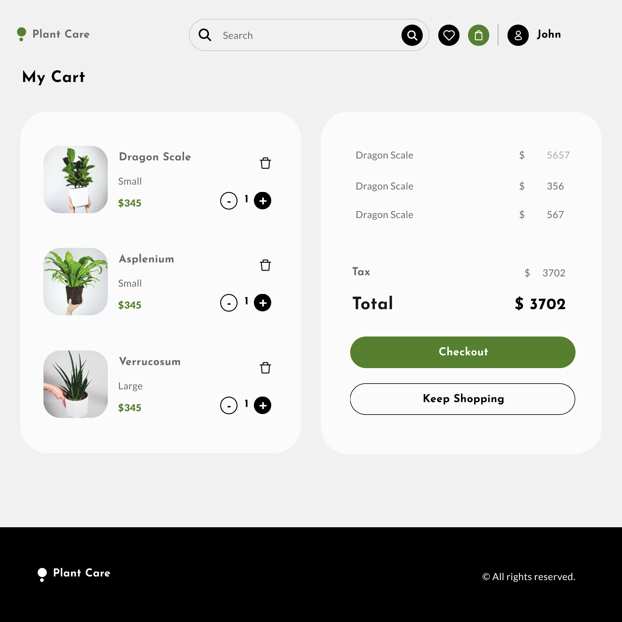
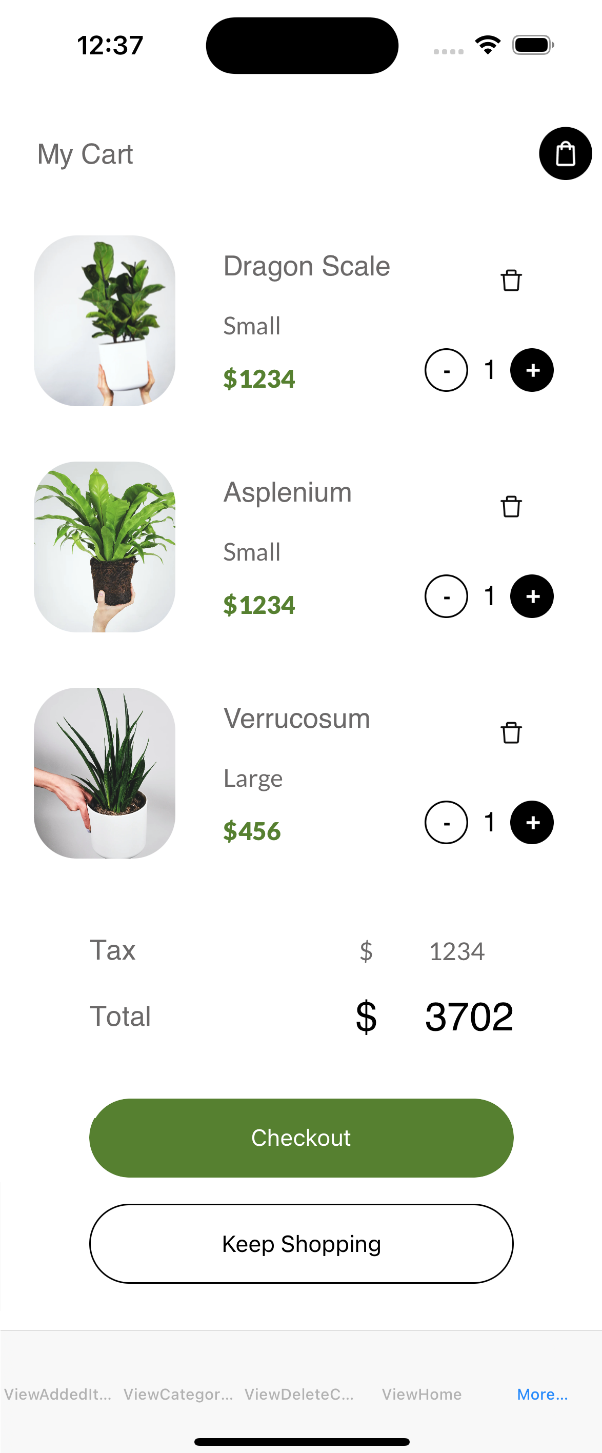
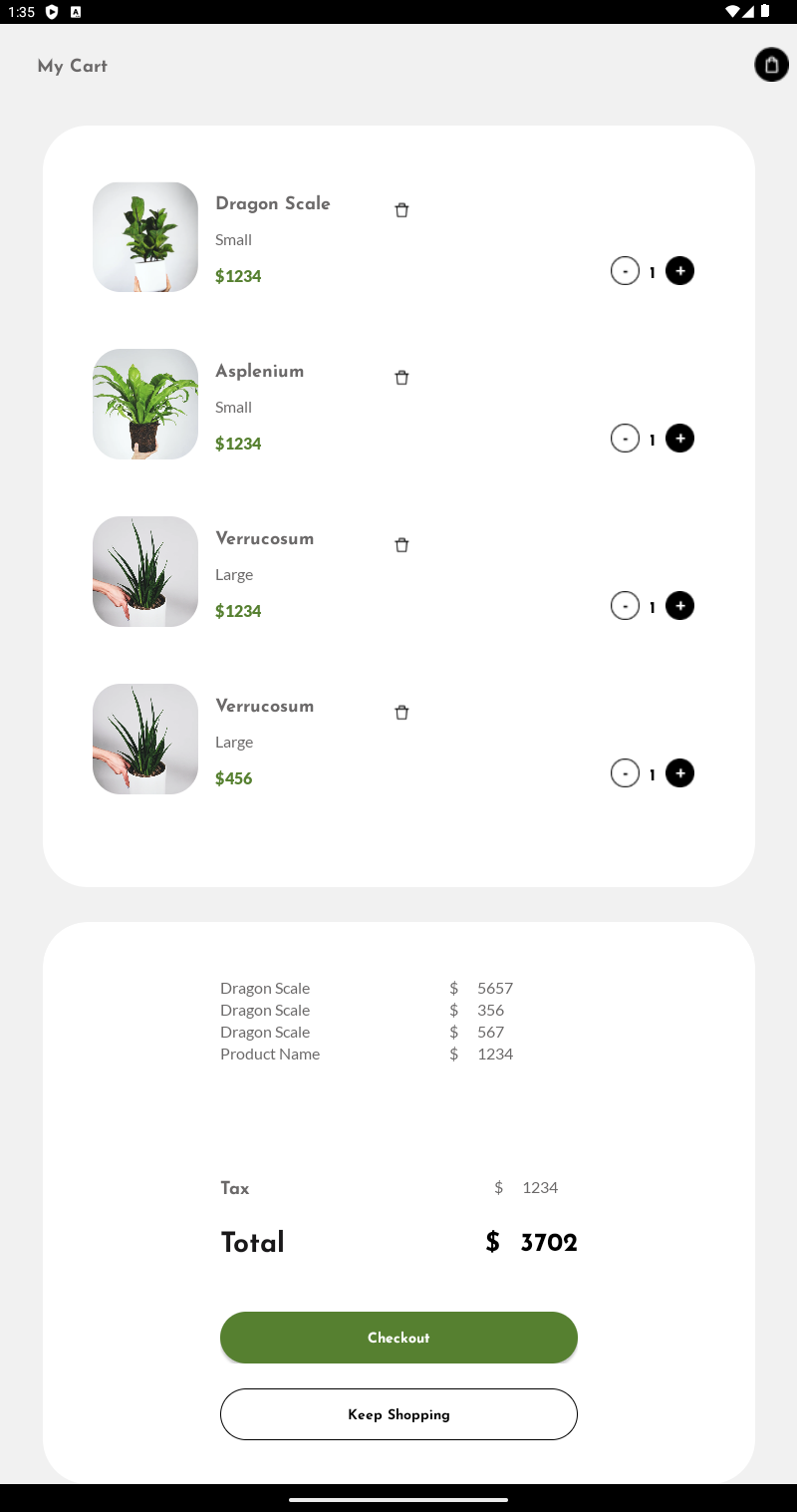
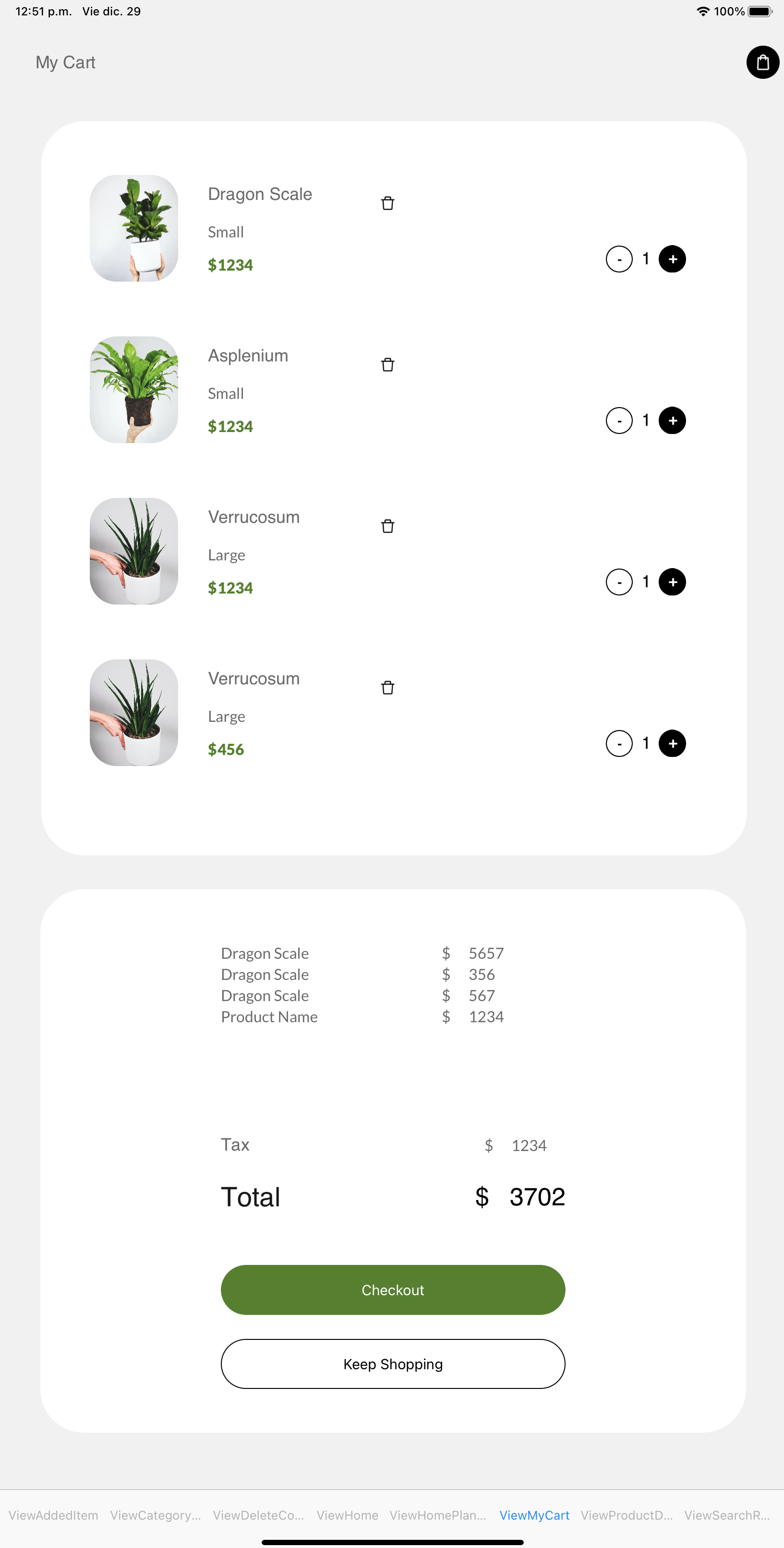
| My Cart |
 |
ViewMyCart
(Execution: Desktop) |
N/A |
N/A |
 |
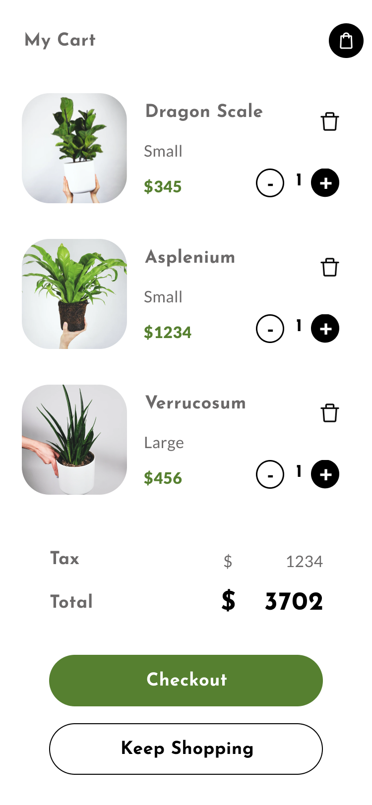
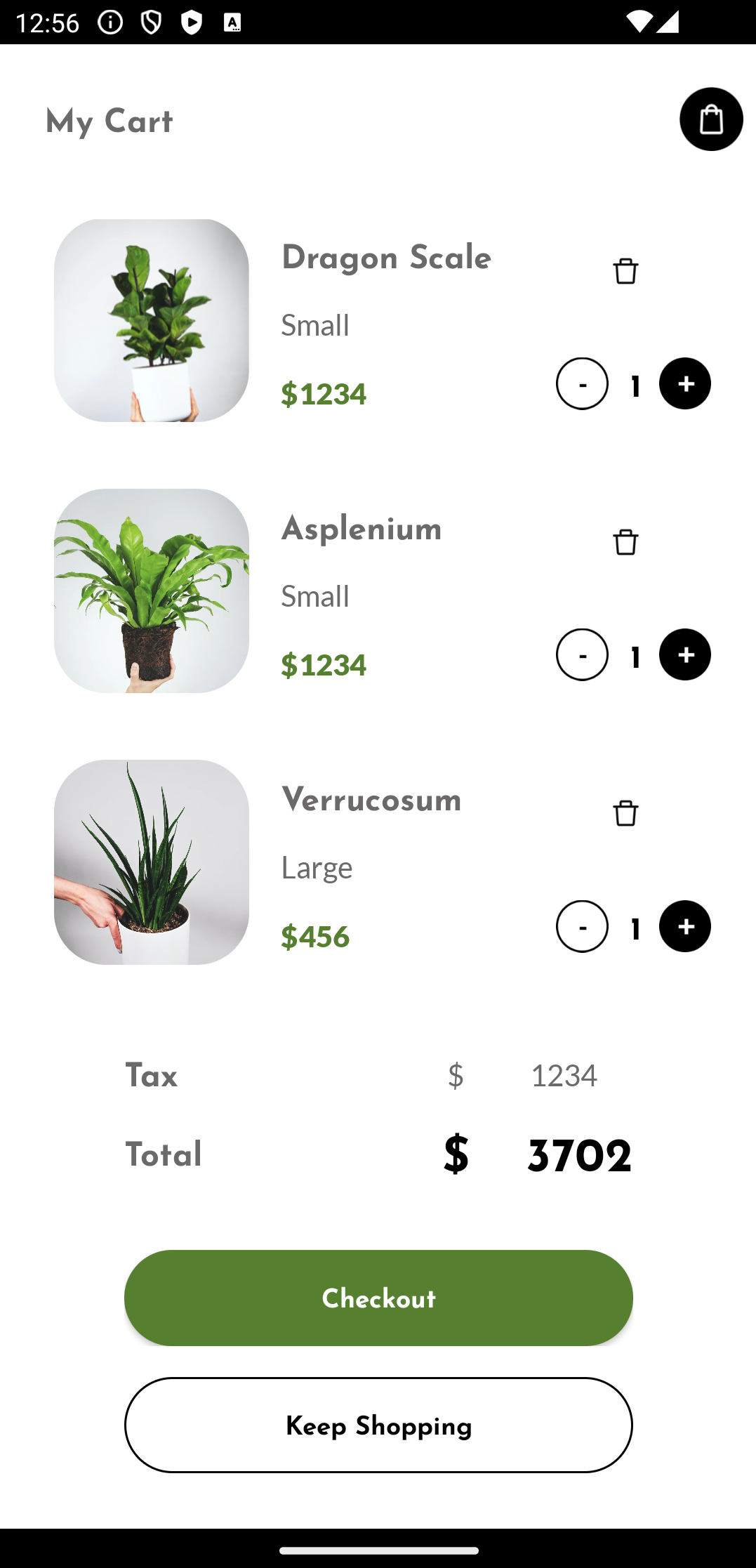
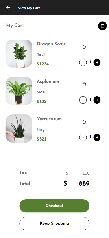
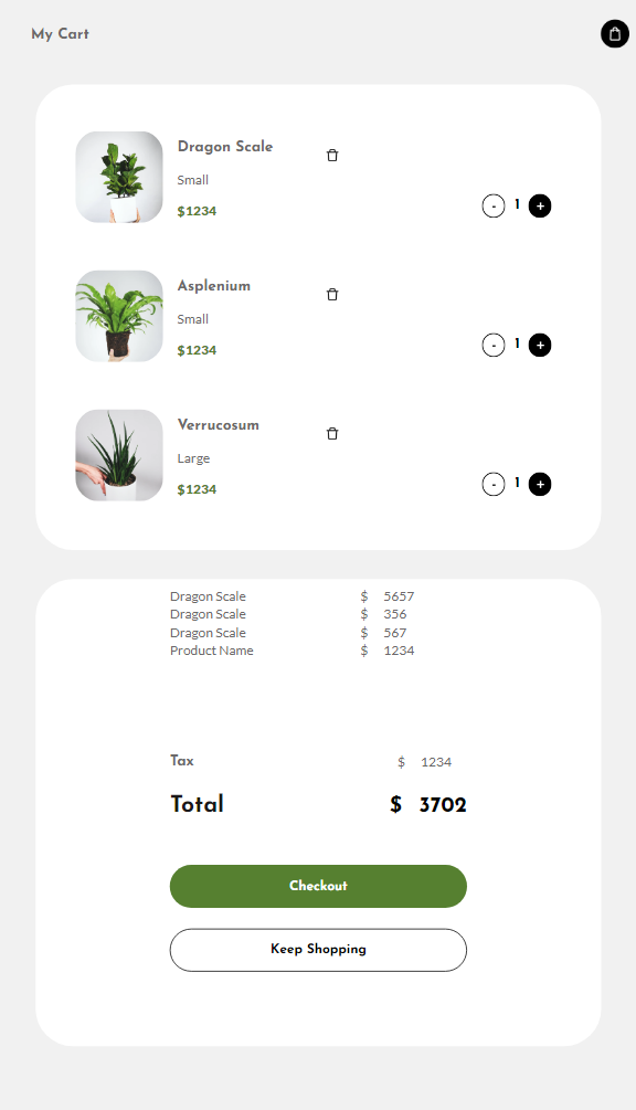
| My Cart - Phone |
 |
ViewMyCart
(Execution: Phone) |
 |
 |
 |
| My Cart - Tablet |
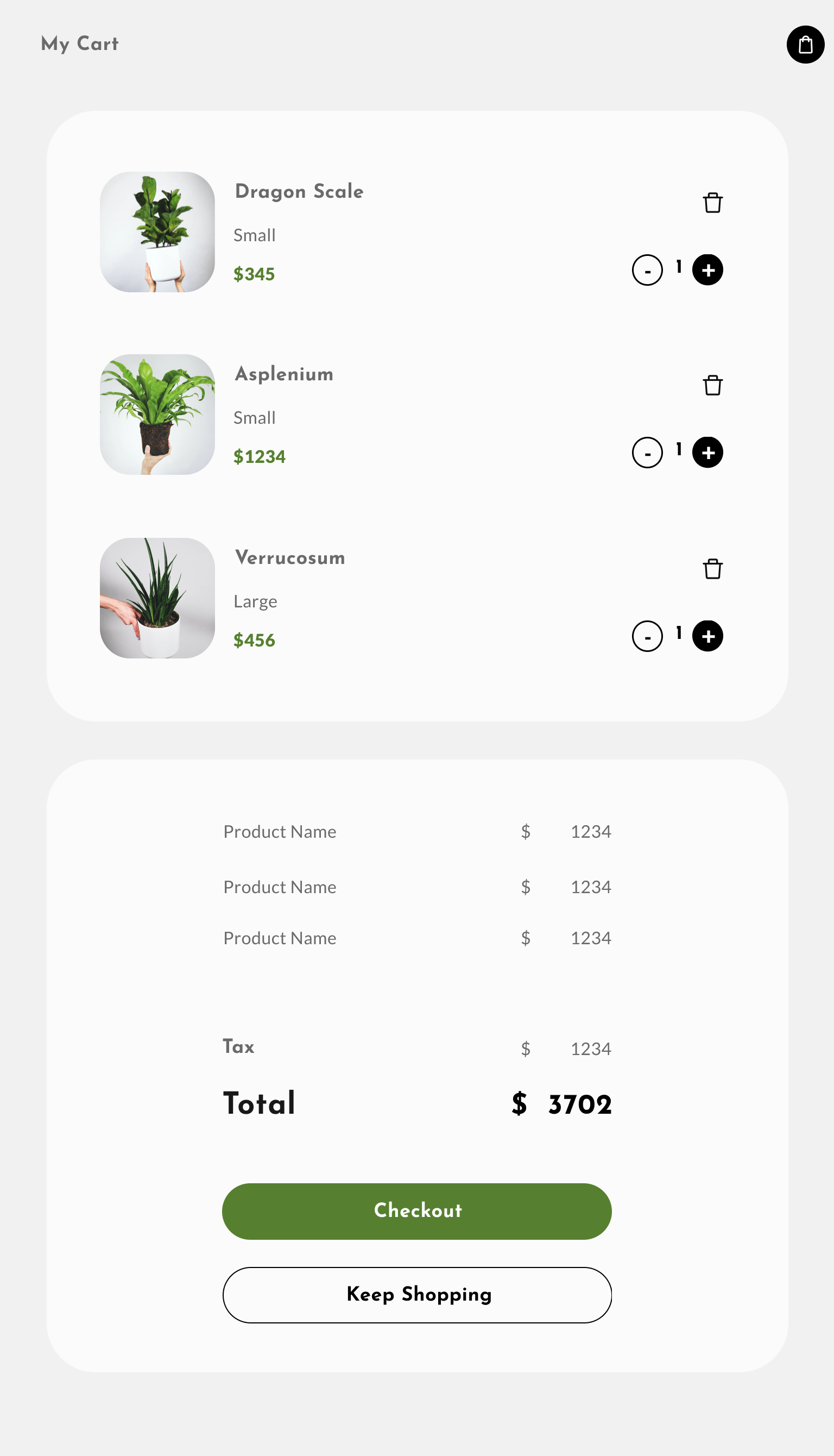 |
ViewMyCart
(Execution: Tablet) |
 |
 |
 |
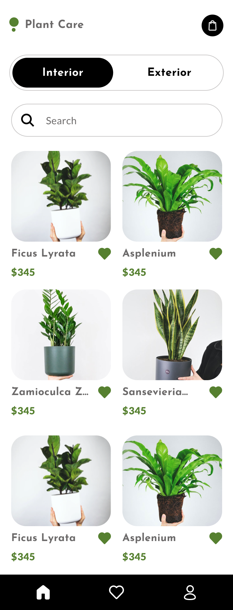
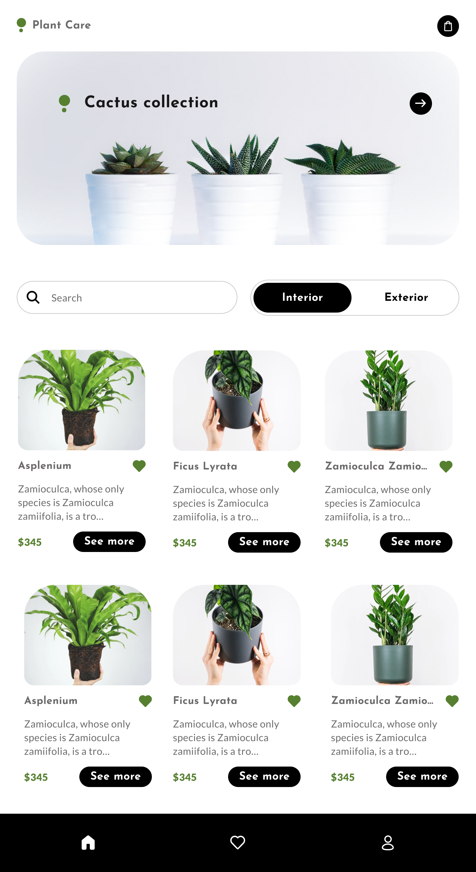
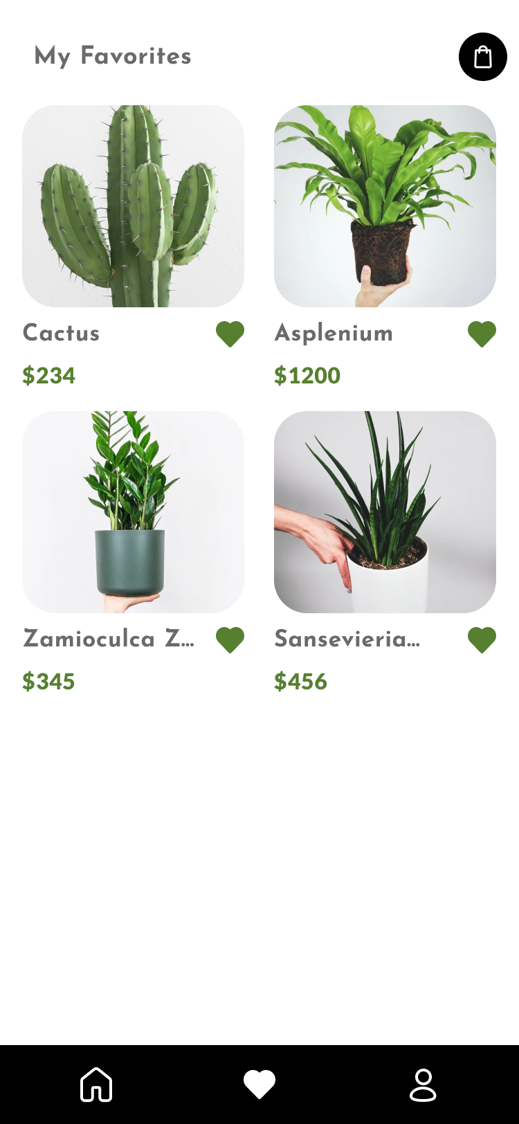
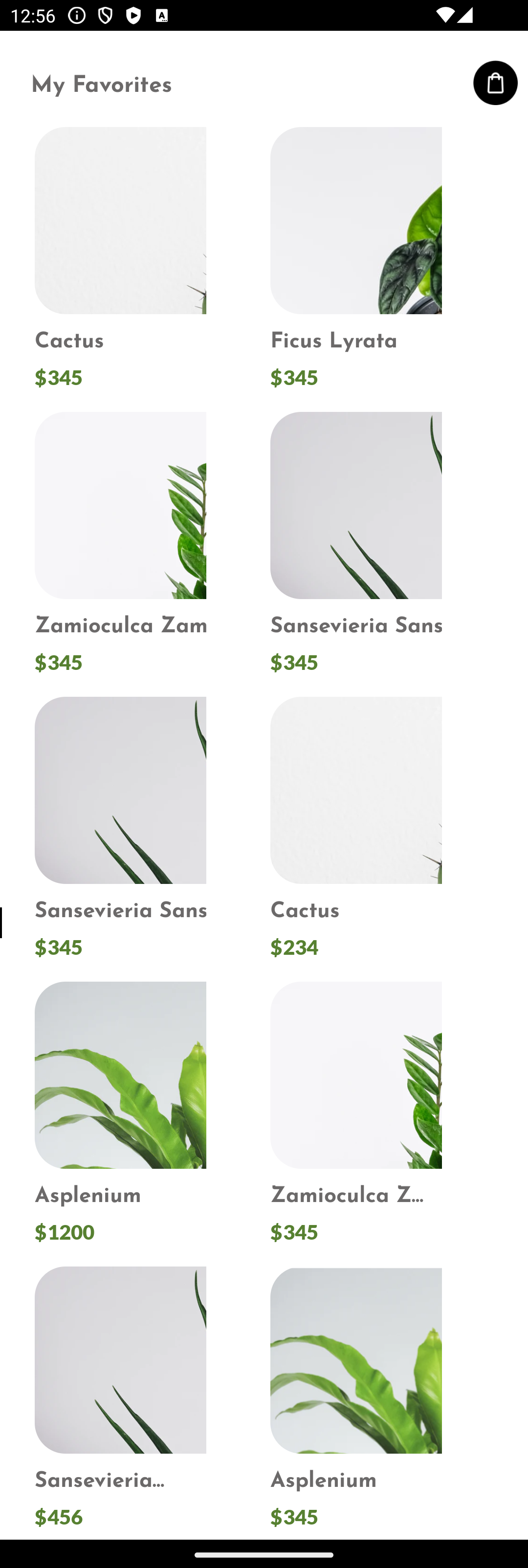
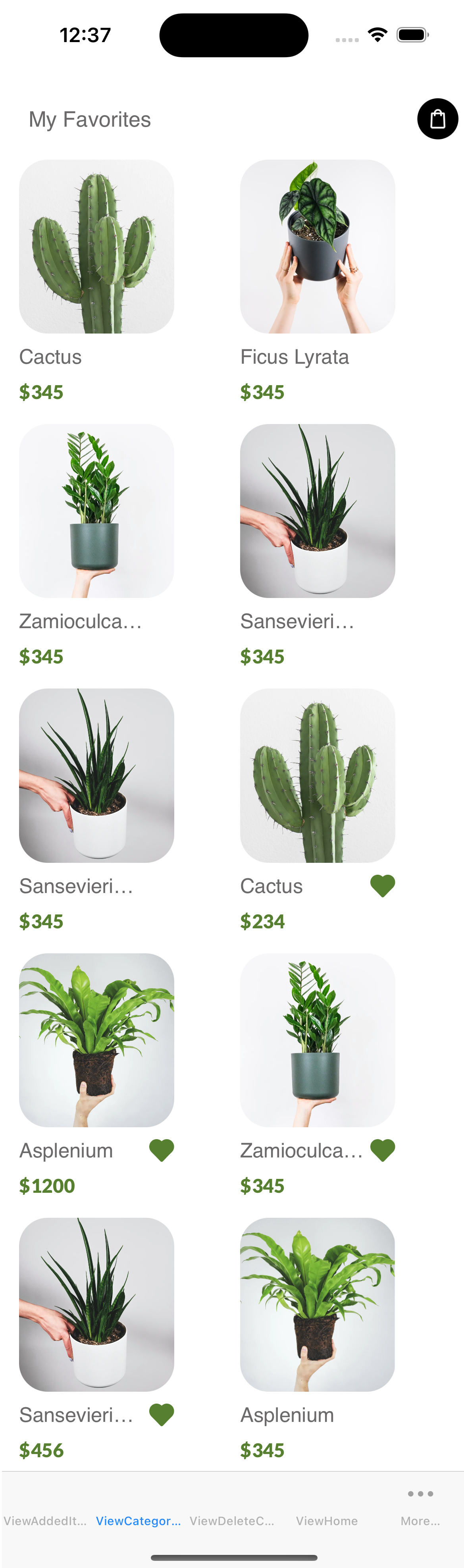
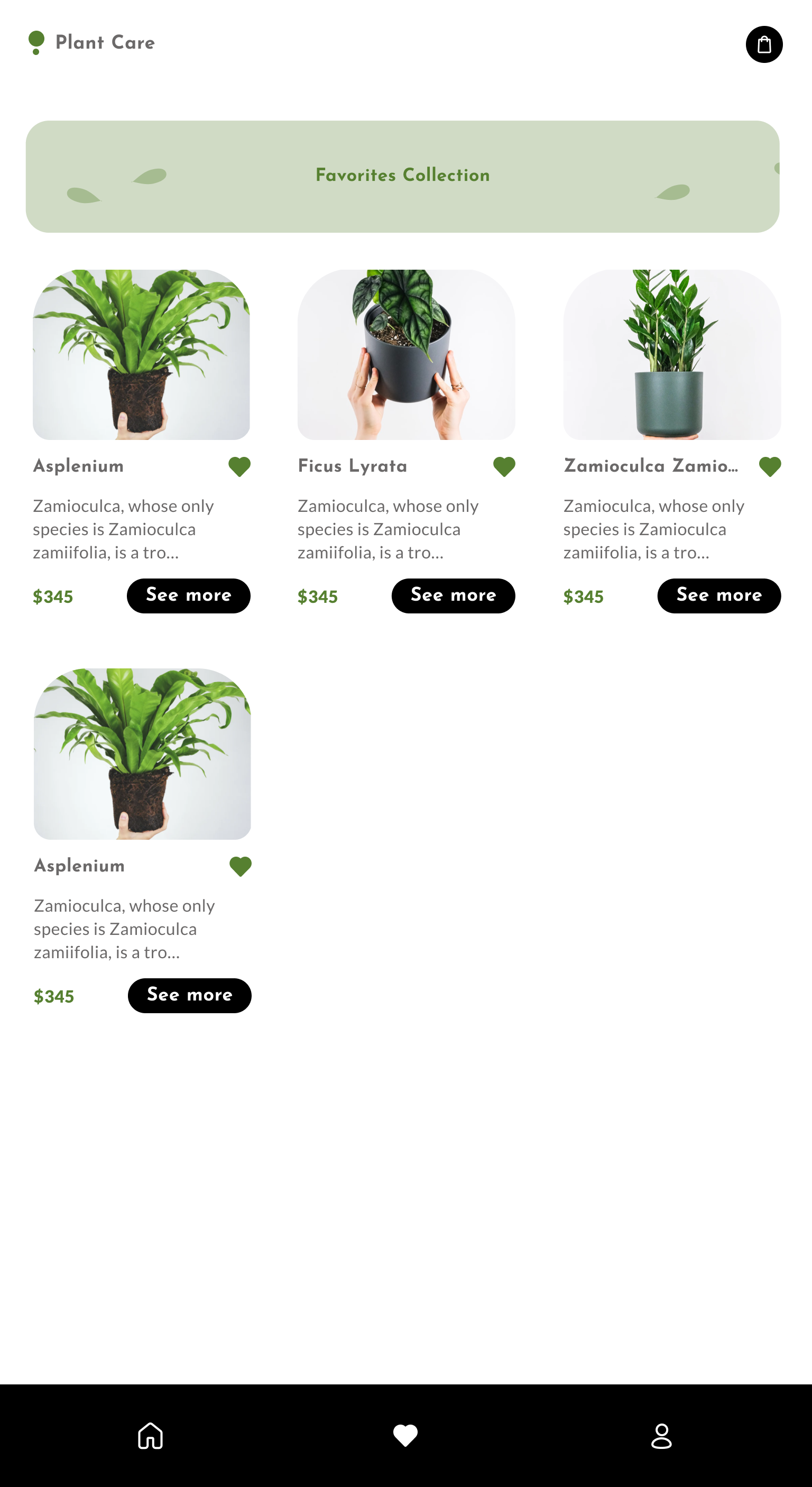
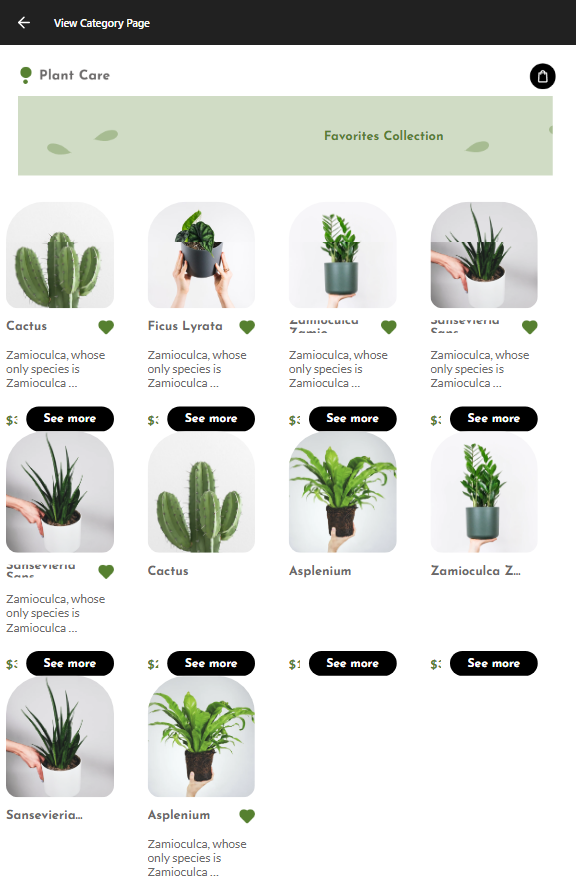
| Category Page |
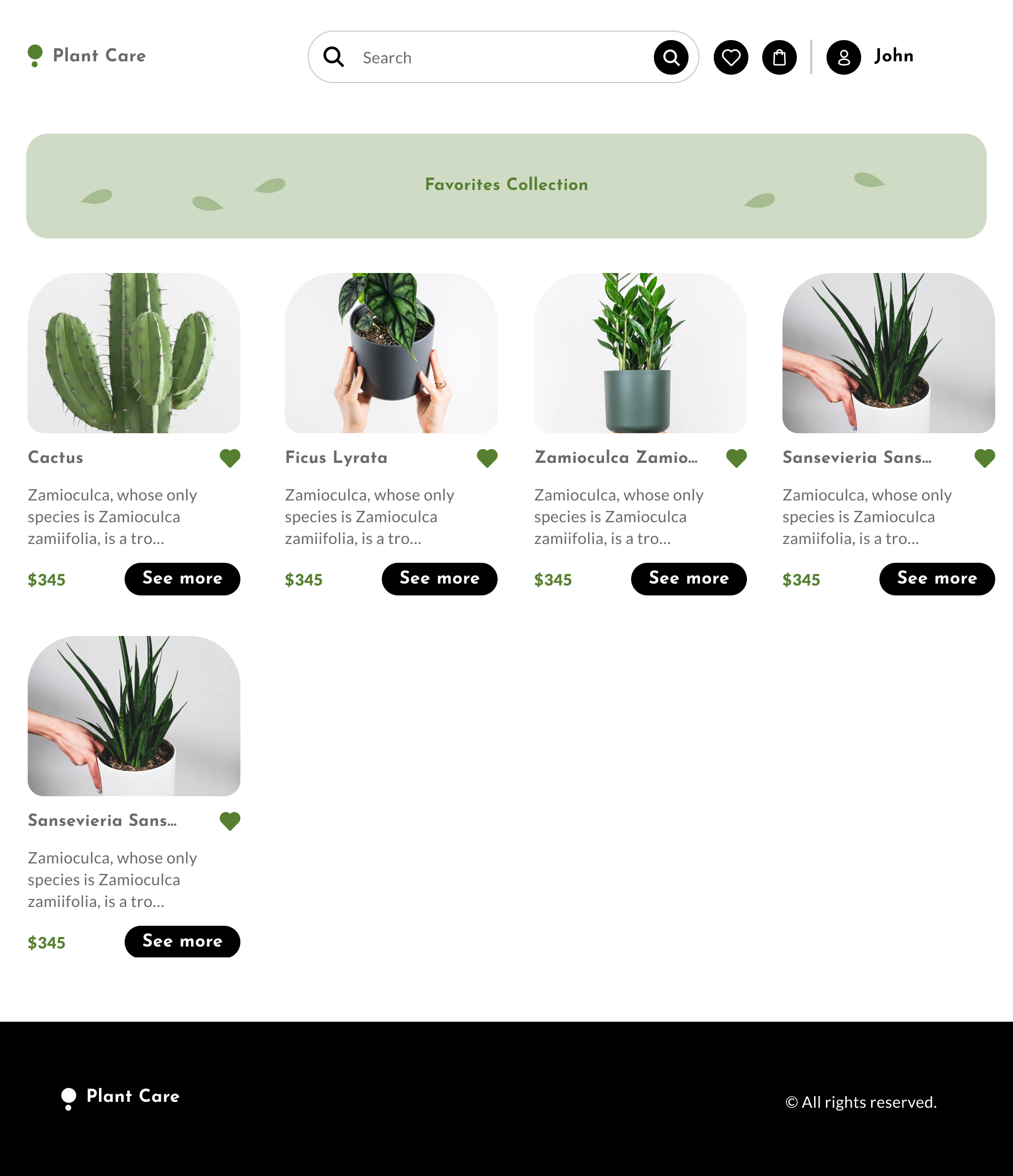 |
ViewCategory Page
(Execution: Desktop) |
N/A |
N/A |
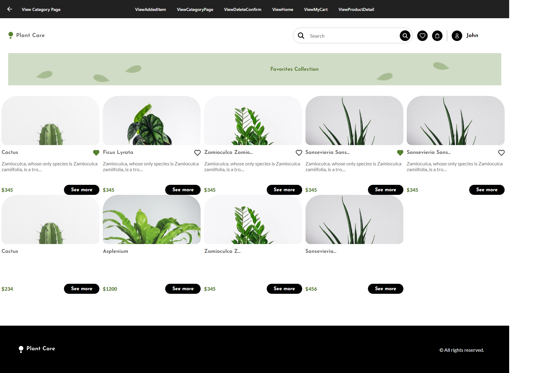 |
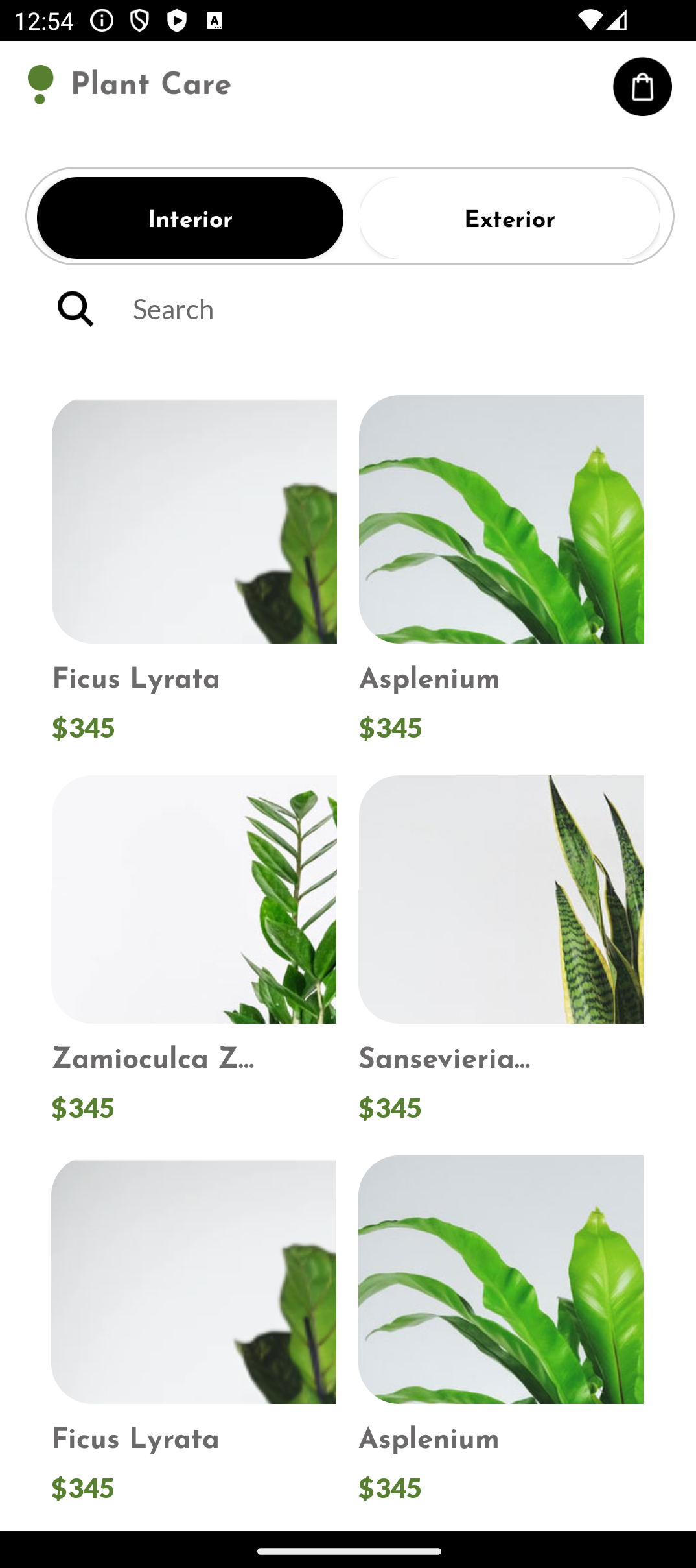
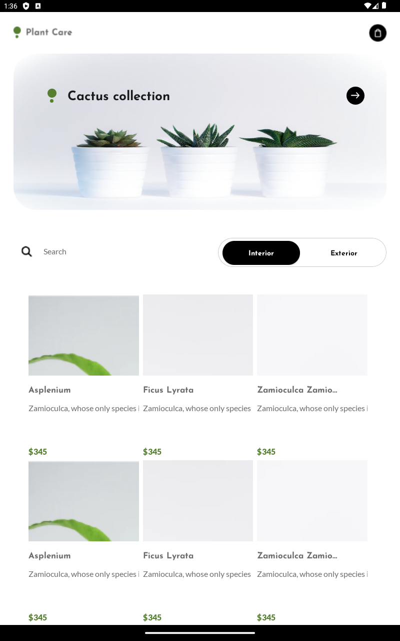
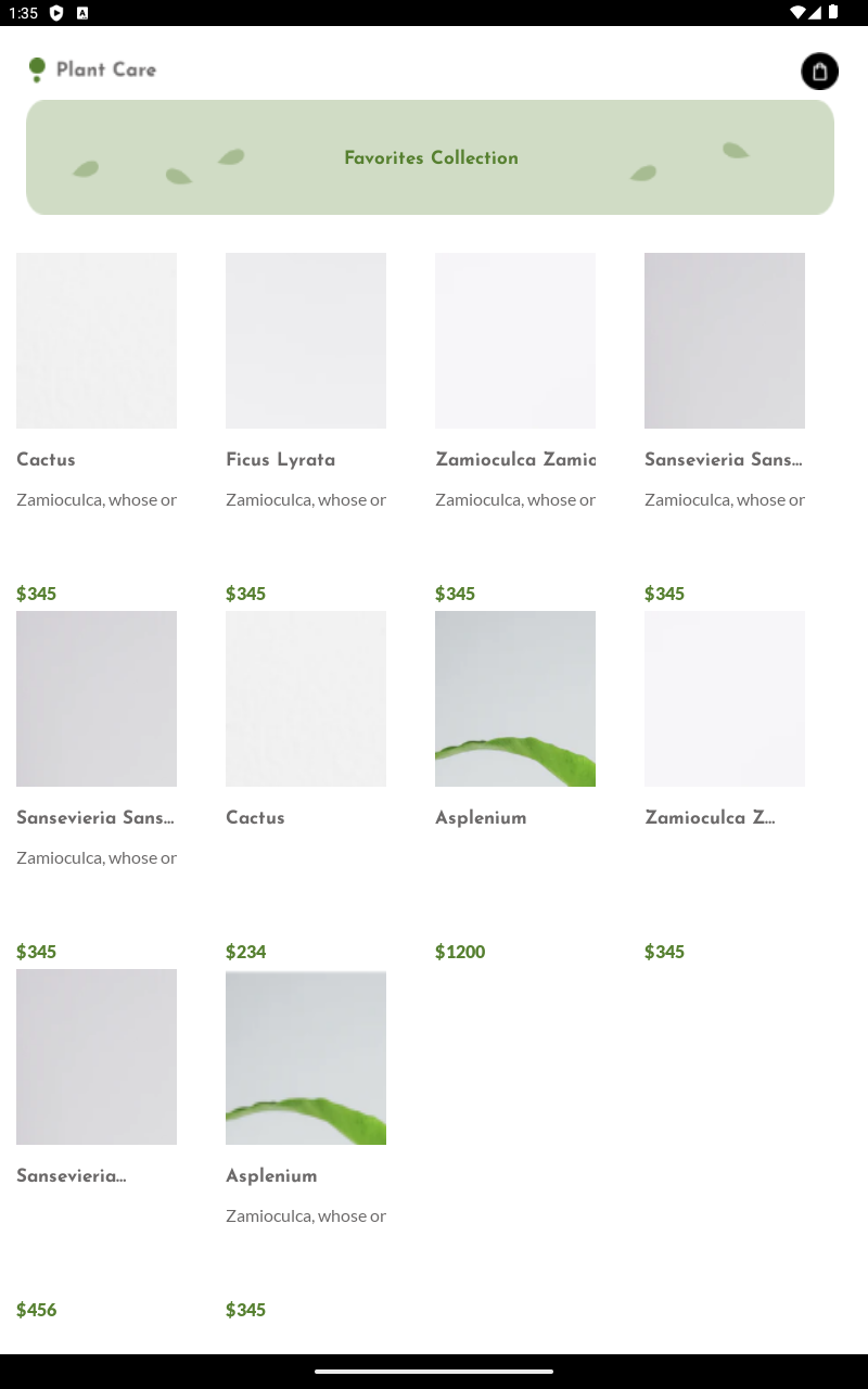
| Category Page - Phone |
 |
ViewCategory Page
(Execution: Phone) |
 |
 |
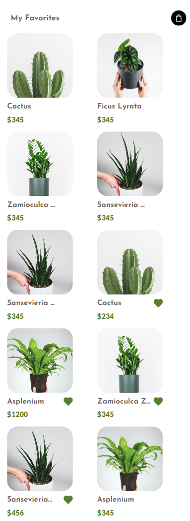 |
| Category Page - Tablet |
 |
ViewCategory Page
(Execution: Tablet) |
 |
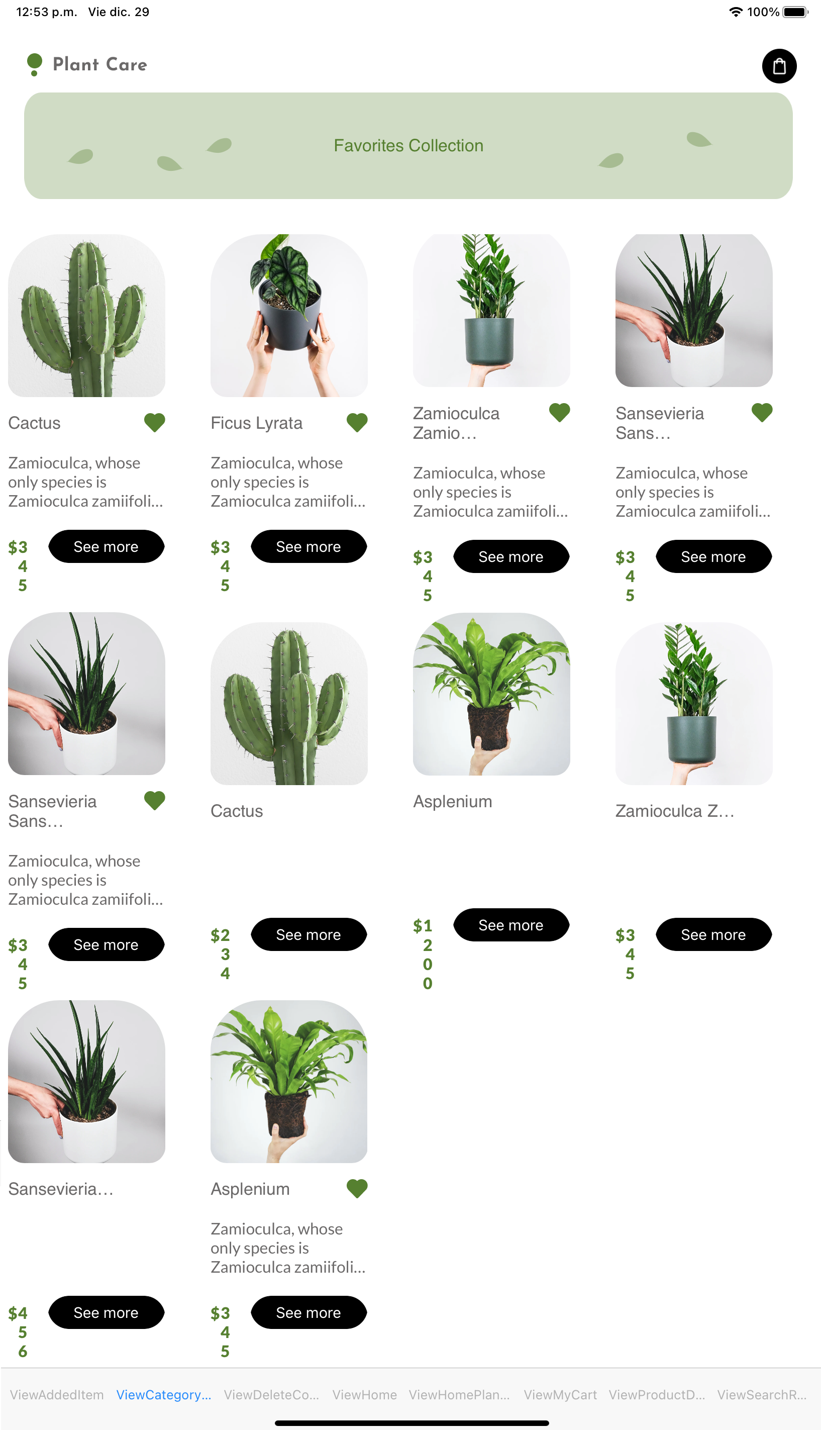 |
 |
- The web application is generated from Panel objects (not Web Panel objects). Learn more about Angular generator.
- The Category Page panel, in each layout, displays more items in the grid than specified in the design. This occurs because the Design Import tool attempts to consolidate data defined within the same grid across multiple layouts. When there is no match, it adds a new item (a semantically duplicated item). To prevent this in your design, ensure that each grid item data matches across the multiple layouts.
- The multi-column grids appear differently on Android compared to iOS and Angular (e.g., in the Home and Category Page panels). This discrepancy arises from a definition gap between Android, iOS, and Angular when setting the Item Per Row property to a value of 2 and using the table-cell with Column Style set to 100%. Specifically, on Android, each table-cell is defined with a width of 100%, leading to overlapping with the next cell. In contrast, iOS and Angular define each table-cell with a width of 50% (100% divided by 2, i.e. the table-cell column width divided by the items per row defined). You can fix this discrepancy with Android manually by adding a new Android-specific layout and setting up the table-cell Column Style with 50% (instead of 100%).
This sample has been made for GeneXus 18 Upgrade 7 and above.