GeneXus allows integrating animations when developing applications, more specifically, Lottie animations.
Lottie is an animation library created by Airbnb. It is highly flexible, allows creating any kind of animations, uses small files, and provides a JSON API to integrate the animations into mobile applications. With these JSON files, you can include the animations in a GeneXus Knowledge Base. Many design software tools provide export capabilities to Lottie JSON format files. In addition, there are several animation repositories (like Lottie Files) with many animations in JSON files that can be downloaded.
To include the animations in the Knowledge Base, you need to do two things:
To create a File object, select in the main GeneXus Menu: File > New > Object and a New object dialog will be displayed. Select File object from the list.
In Design System objects, you can create a class to add your animations to an application.
For example: the class called “Animation” where you set the Animation type, in this case, Lottie Animation Type.
.Animation
{
    gx-animation-type: idLottie;
}

.LoadingAnimation
{
    @include Animation;
    gx-lottie-file: gx-file(LottieAnimationLoading);
}
And a “LoadingAnimation” class that contains the “Animation” class and declares the jsonFile you want to add to your application.
After the Design system classes are created, the animation is ready to be included in the application.
Now that the animations are included in the KB, you can integrate them into the application. There are four ways to make this integration:
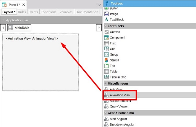
With the Animation View User Control, an animation can be included on any screen of an application. The control provides methods that allow setting the animation and managing its execution and progress.

Event ClientStart
   Composite
      AnimationView1.SetAnimation("LoadingAnimation", true)
      AnimationView1.Play()
   EndComposite
Endevent

Event 'PauseAnimation'
   AnimationView1.Pause()
EndEvent

Event 'SetProgress'
   Composite
      &Progress = 0.5
      AnimationView1.SetProgress(&Progress)
   EndComposite
EndEvent
It is possible to use animations to customize the loading process of object forms and grids. That is, you can replace the usual loading circle with a more sophisticated Lottie animation.
To do this, there is a property that can be set in the Styles section of a Design System Object, named gx-loading-animation-class.
The definition is as follows:
.Form

{
      gx-enter-effect: gx_default;
      gx-close-effect: gx_default;
      gx-call-type: gx_default;
      gx-target-size: gx_default;
      gx-target-width: 100%;
      gx-target-height: 100%;
      gx-content-size-change: gx_default;
      gx-input-view-appearance: gx_default;
      gx-loading-animation-class: Animation;
      gx-loading-animation-behavior: platform_default;
}

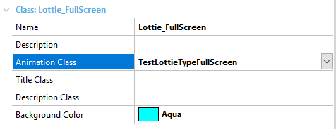
An animation can be used to customize a Progress Indicator User Control. To do this, a Progress theme class has to be created and an Animation-type class name set in the Animation Class property of this class. The indicated animation will be displayed when the Progress Indicator User Control is shown.
It is important to ensure that the class assignment is done before showing the progress indicator. The code should be configured as follows:
GeneXus.Common.UI.Progress.Class="Progress"
GeneXus.Common.UI.Progress.Show()

It is possible to use an animation as the Launch Screen of your application. This can be set in the Styles section of a Design System Object.
.Application

{
     gx-background-image-mode: stretch;
     gx-image-loading-indicator: False;
     gx-launch-screen-animation-class: Animation;
}
This section will guide you to integrate Lottie animations in grids using the Animation View control.
First, add the Lottie JSON files to the Knowledge Base, as explained above.
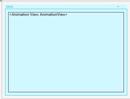
Next, set up the Grid and Animation View control. To do so, drag a Grid to the Layout of a Panel object, and then drag an Animation View control to that Grid:

Define the following in the Load Event of the Grid:
Event GridAnimations.Load
    AnimationView.SetAnimation("Animation1", True)
    AnimationView.Play()
    Load
    AnimationView.SetAnimation("Animation6", True)
    animationView.Play()
    Load
    AnimationView.SetAnimation("Animation4", True)
    animationView.Play()
    Load
    AnimationView.SetAnimation("Animation2", True)
    animationView.Play()
    Load
EndEvent
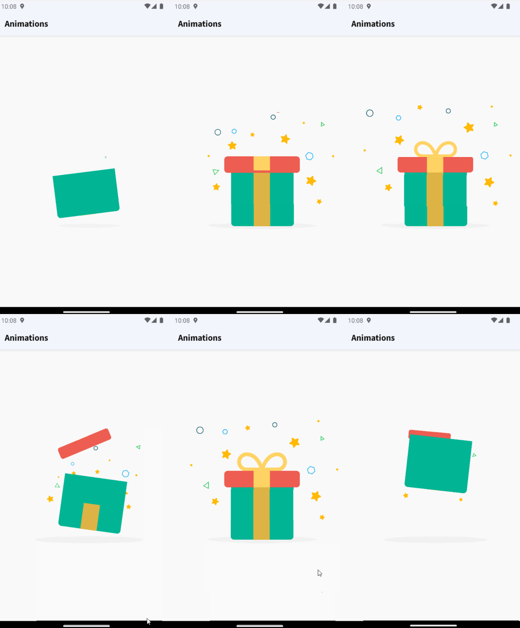
You can make the Grid display part of the next animation in a way that encourages the user to swipe, as shown below:

To do so, define the following grid properties:
Control Type property: Grid
Scroll Direction property: Horizontal
Snap to Grid property: True
In the Style section of a Design System Object (DSO), create custom classes to enhance the appearance of the Grid and its elements.
Define a class named .GridAnimationExample to add padding to the animations within the Grid.
.GridAnimationExample {
    @include Grid;
    padding-right: 30;
    padding-left: 30;
}
Next, assign this class to the Class property of the Grid to apply the style.
Define a class named .GridAnimationTable in the Style section of the DSO to add margins to the tables within the Grid:
.GridAnimationTable {
    @include GridContainer;
    margin-left: 5;
    margin-right: 5;
}
Next, assign this class to the Class property of the table containing the Grid elements.
Note: The classes used in this example with the @include rule refer to predefined styles that are part of the Unanimo DSO library in GeneXus.