In many cases, you need to show information in a visual way, and Charts are one of the best formats to do so.
You can display numeric information corresponding to grid items as a chart, which can be a pie or a timeline (if you have a date attribute):
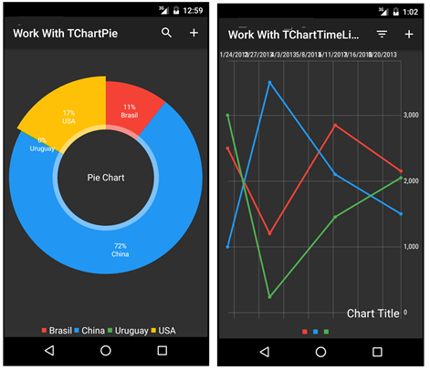
Below are both examples: Pie chart and TimeLine chart.
Sample 1
This control can be used to take information from a Structured Data Type or Attributes. In this article, Attributes will be used as the information source.
The following Transaction object with the Work With Pattern applied (see Applying Work With Pattern) is going to be used for the example:
Country
{
     CountryId            Id
     CountryName          Name
     CountryPopulation    Numeric(9.0)
}
Set the following properties for the Work With List Node:
.
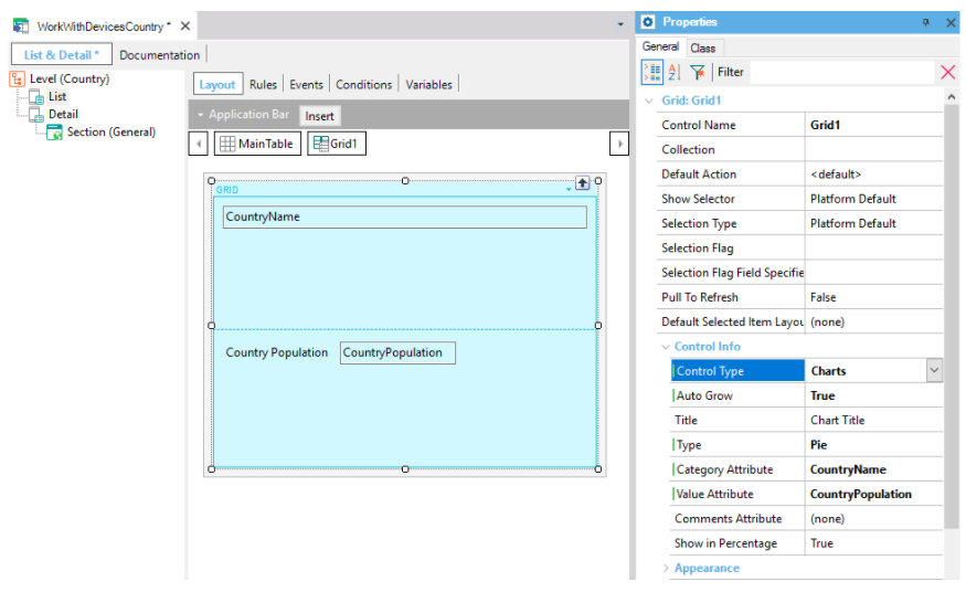
Next, configure the properties to make this control work. Take a look at the properties marked in the picture above:
| Properties |
Description |
| Control Type |
Charts. You want the grid to be shown as a Chart. |
| Title |
Name of the chart that will be shown on the device above the chart. |
| Type |
Type of chart you want it to be (Pie or Timeline); in this case, it will be a Pie. |
| Show in Percentage |
This property sets if the values will be shown as real values or percentage values. |
| Value Attribute |
Attribute that will be used for the chart. In this case, the Country population values. |
| Category Attribute |
Attribute that will be used to show the reference to each slice of the chart. |
| CommentsAttribute |
Attribute displayed to the right of the information of the selected portion. |
Notes:
- If you don't set the Value attribute property, the control will take the first Numeric attribute as the value attribute by default. In this case, you need to set this property because otherwise, the value attribute would be Country Id.
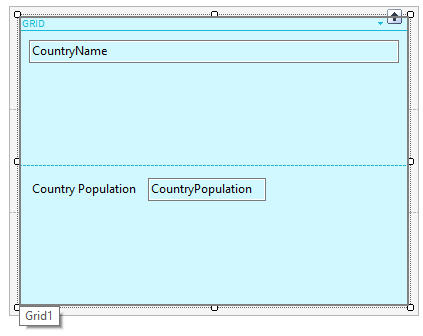
- Make sure that the Value Attribute is on the Grid as shown in the following image:
Done!
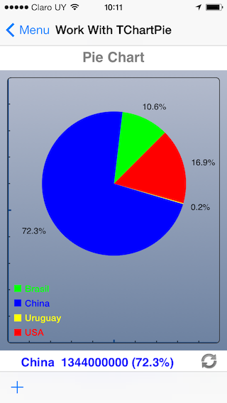
Your WorkWithDevicesCountry will show in a pie chart the percentages per country of the South American continent population. When a slide is tapped, the value of Category Att is shown below:

Sample 2
This example uses a timeline chart that takes the information from an Attribute.
For this example, the following Transaction object is going to be used:
Expenses
{
      ExpensesId*          Id
      ExpensesDate         Date
      ExpensesCar          Numeric(8.0)
      ExpensesHome         Numeric(8.0)
      ExpensesFood         Numeric(8.0)
}
Configure the following properties for the Work With List Node:
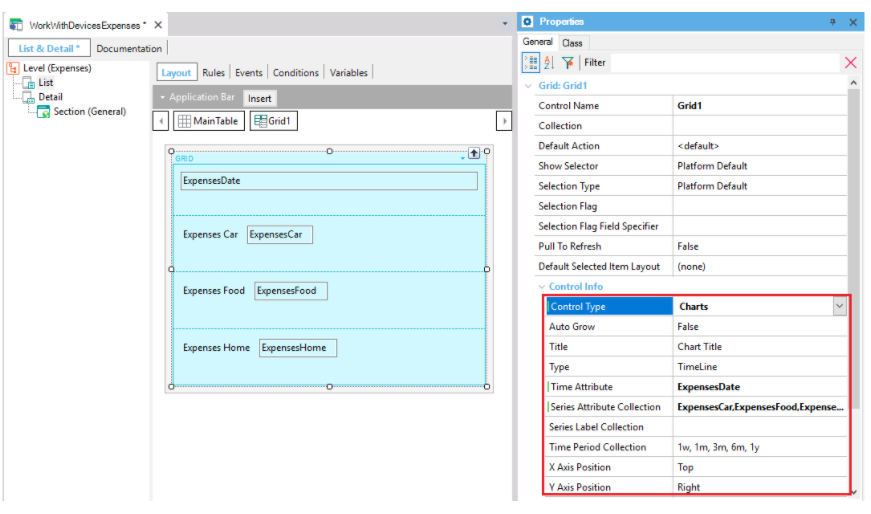
| Time attribute |
This property is only available for TimeLine charts. If it is left blank, GeneXus will set the first attribute with a Date domain as the "Time Attribute." |
| Series Attribute Collection |
If this property is not set, the default behavior is the same as described in Example 1 (use the first numeric attribute of the list). In this case, you want to record your home, food, and car expenses, so you want these 3 attributes to appear on this property. To do so, enter the exact name of the attributes separated by commas. |
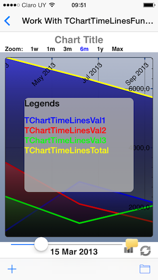
| Series Label Collection |
If this property is left blank, the labels are shown with the attribute name. You have to write these labels in the same order in which the attributes appear on the Serial Attribute Collection property (the label and attribute are associated by position). |
Note: You need to have the attributes that you set as the Time attribute and as the Series Attribute collection on the Grid as shown in the image above.
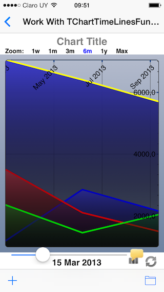
Done. This chart will show the evolution of your expenses organized into different categories.
 Container of sections in the detail screen