Defines the Platform navigation style.
| Default | Split or Flip are automatically selected depending on the screen size. Usually Flip is for phones and Split is for tablets. This is the default value. |
| Flip | Detail information is displayed on a separate screen once an item is selected in List. |
| Split | List and Detail information is displayed on the same screen. This value is ignored when running on phones. |
Generators: Android, Apple
Level: Platforms node > Platform
Depending on the features of the target device platform (OS, Size, OS version) you may want to vary how the user interacts with and, more specifically, how the user navigates your app. To achieve this, GeneXus provides the Navigation Style property that allows you to change this behavior at the platform level.
Note that you can only define one navigation style in your application for each possible combination of the above characteristics.
This property applies only at design time.
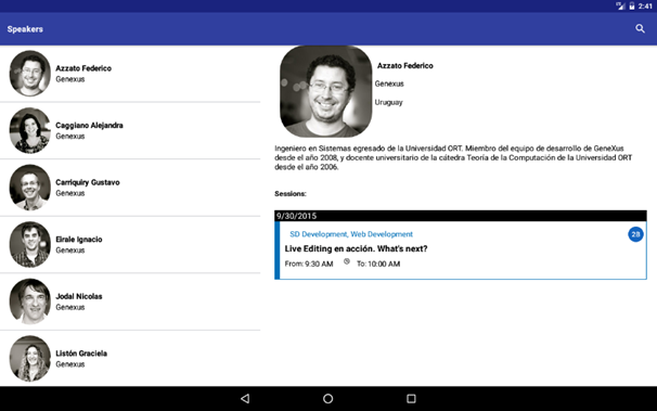
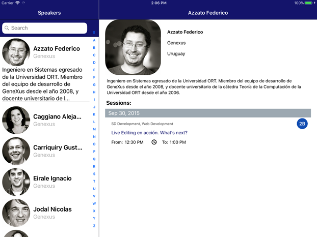
The information on the screen is divided into two sections. As shown in the picture below, there is a panel on the left (in this case, a list of speakers) and the main area is on the right. Note that the orientation is landscape. If the device were in portrait mode, the only area shown would be the main one, and the left one would be hidden until you made it visible by sliding to the right. When running it on a Smartphone device, the Split value will be ignored and the default value will be assumed.
Android
Apple
It works on Tablets and Smartphones. Data is displayed in a single area and may not be divided.
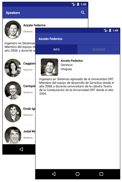
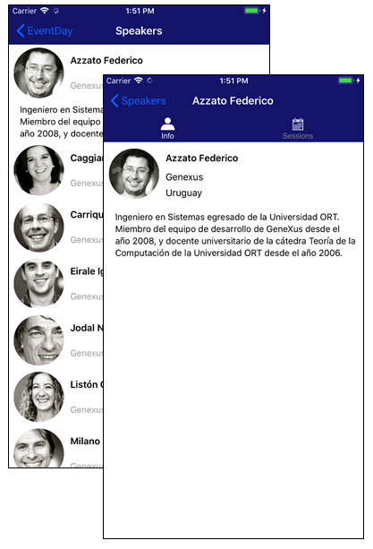
This style is used when the application displays detailed content on a separate screen after a user selects an item from a list.
|
Android
|
Apple
|
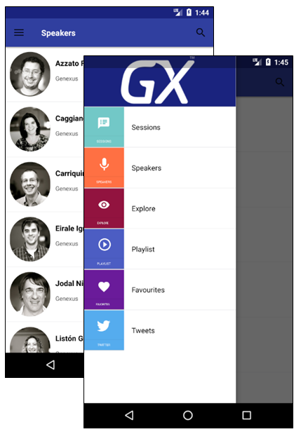
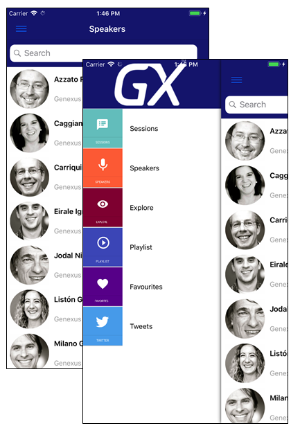
It works on Tablets and Smartphones. The menu is always available through a button on the upper left corner or by sliding to the right. Read more in Slide Navigation Style.
|
Android
|
Apple
|
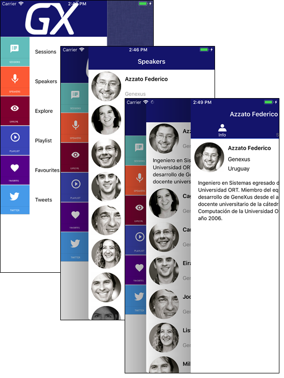
It works on Tablets and Smartphones. As shown in the picture below, the main menu is displayed in the left area, the actual panel is shown on the right, and the last navigated panel is in the middle. When you select an element from the main menu, the cascade navigation panels are reset. The main menu is always accessible.
Navigation Start Events in Native Mobile Applications
Slide Navigation Style
Pattern settings