The Canvas control is a container that allows you to accurately order the elements in the layout by using absolute positioning, which allows you to overlay them.
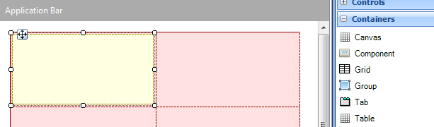
The canvas container can be added from the toolbox to any layout, and it looks as shown below:
The canvas container has the same properties as the Table control, in addition to the properties Canvas width and Canvas height. The canvas width and height depend on the canvas size in the designer; in the device, the canvas will take the size of its container (for example, when it is in a table it will take the size of the cell it is saved in).
The controls placed within a canvas have seven new properties:
| |
|
Possible values (Panel object) |
Possible values (Web Panel object) |
| Left |
Distance from the control to the left side of the canvas |
Dips, Percentage |
px, Percentage |
| Width |
Width of the control |
Dips, Percentage |
px, Percentage |
| Right |
Distance from the control to the right side of the canvas |
Dips, Percentage |
px, Percentage |
| Top |
Distance from the control to the top of the canvas |
Dips, Percentage |
px, Percentage |
| Height |
Height of the control |
Dips, Percentage |
px, Percentage |
| Bottom |
Distance from the control to the bottom of the canvas |
Dips, Percentage |
px, Percentage |
| ZOrder |
The ZOrder property specifies the stack order of a control. (A control with greater stack order is always in front of a control with a lower stack order) |
Numeric |
Numeric |
1) If the control is not anchored to an axis, its position is calculated in percentages.
For example, an image is added that isn’t anchored to the right nor to the left, positioned at X = 50 in a canvas that is 100dips wide; this image will always be positioned at 50% of the canvas.
2) If the control is anchored to both sides of an axis, the distance between the control and both sides will remain constant and the size of the control will vary.
3) The values for the Left, Right, Top and Bottom properties may be negative numbers. This means that the control will be moved in the opposite direction.
For example, if you set a Top value of -20 dips for an image with height 100 dips, only the lower 80 dips of the image will be visible.
Setting negative values is useful when you want to animate a control, for example, to make it appear on screen by performing a user action. This can be achieved by setting a Theme Class to the control that has the Animated property set to True and a transformation to move the control to another position.
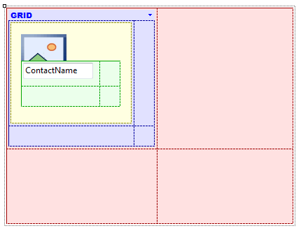
In the example below, the canvas container is used to position the contacts’ names over the photos.

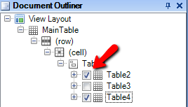
When using the canvas container, it can be very useful to hide the controls during the layout design. This can be done from the Document Outliner, using the checkbox next to each control:
HowTo: Overlay attributes
Sample KB