Specifies how the image is shown depending on the size of the image and of the control where the image is used. It helps prevent image distortion.
| | This is the default value. Indicates that no specific value is assigned to the property. |
| No Scale | Respects the original size of the image, regardless of the control area size. |
| Responsive | Sets a responsive behavior. |
| Fill Keeping Aspect Ratio | Increases or decreases the width and height of the image to fill the entire control area while maintaining the aspect ratio of the image. For example, if the image size is 100 x 200, and the control size is 50 x 50, the image size is converted to 50 x 100. |
| Fill | Scales the width and height of the image to fill the whole size of the control area. |
| Fit | Scales the width and height of the image to display it fully, keeping the aspect of the image. For example, if the image is 100 x 200, and the control is 50 x 50, the image is converted to 25 x 50. |
| Tile | The image is not scaled. It is repeated horizontally and vertically to fill the control size. |
Generators: Android, Apple, Angular
Level: Design System Style Class
Usually, when you place an image in a specific area of the layout, you want to show this image without distortion. The problem arises when the image size and the area size are not the same (the most common scenario).
For example, if you have a photo sized 1000 x 800 and you have to use it in an area of 200 x 150, there is an aspect ratio difference.
What you need to do is resize the original image without distortion, which in this case would be 200 x 150, while keeping the aspect of the photo. Here you should use the default Value: scaleToFitkeepingAspect.
Content modes are used to resize the contents (image in this case) of your view area.
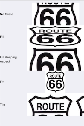
You have the following image, whose size is 500 x 559:

And it is used within a table cell that is smaller than the image. See how it is shown using the different values of the Content Mode Property:
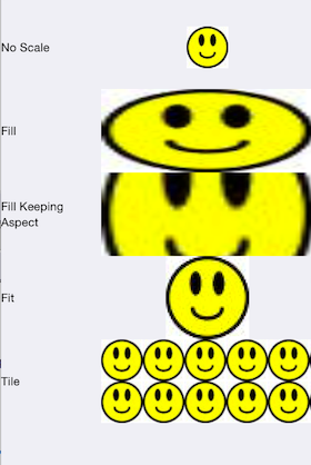
Considering this image, whose size is 50x50:

It is used within a table cell that is bigger than the image. See how it is shown, using the different values of the Content Mode Property:
This property is available since GeneXus 17 Upgrade 6.
Design System Object