Images are fundamental to creating an attractive and easy-to-use application. There are several types of images used in Panel objects each serving a different purpose.
There are numerous design resources for creating an application that is both appealing and validated across all markets: Google Play (Android) and Apple Store. For example, an image required by the iPhone needs to be a different size for the iPad. This variation applies to every device and format. Additionally, images for landscape format differ from those used in portrait orientation.
This document outlines the types of images used in such applications and the key aspects to consider while designing them.
This is the image from which the application installed on the device is identified.
Examples:
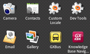
- For Apple, they must NOT be transparent, the icon is designed on a square and the rounded borders will appear automatically on the device.
- For Android, the transparency aspect may exist or not.
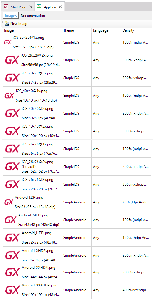
In GeneXus, all these images must be loaded into a Image object on the KB, and varying according to the Theme or density you define which image goes for each platform. So then, for example, you can set the Image object that contains all the icons on every Application Icon property and changes the icons only on that object.
| |
iOS devices |
iPhone 6 Plus (@3x) |
iPhone 6 and iPhone 5 (@2x) |
iPhone 4s (@2x) |
iPad and iPad mini (@2x) |
iPad 2 and iPad mini (@1x) |
| |
App icon |
180x180 |
120x120 |
120x120 |
152x152 |
76x76 |
| |
App icon for App Store |
1024x1024 (*) |
| |
Spotlight search results icon |
120x120 |
80x80 |
80x80 |
80x80 |
40x40 |
| |
Settings icon |
87x87 |
58x58 |
58x58 |
58x58 |
29x29 |
| |
Toolbar and navigation bar icon (optional) |
66x66 |
44x44 |
44x44 |
44x44 |
22x22 |
(*) As of GeneXus 15 Upgrade 7, if the Apple Application Icon property has a single Image with 1024x1024 resolution, other smaller images will be generated automatically.
| |
Android devices |
ldpi |
mdpi |
hdpi |
xhdpi |
xxhdpi |
xxxhdpi |
| |
Application Icon |
36x36 (120dpi) |
48x48 (160dpi) |
72x72 (240dpi) |
96x96 (320dpi) |
144x144 (480dpi) |
192x192 (640dpi) |
For more information refer to Density property.
Official guides by device:
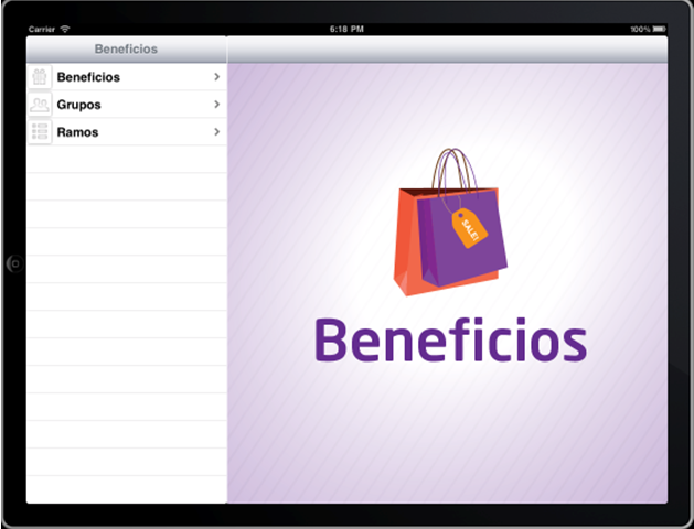
This is the image shown while the application is in the loading process.
Example:
| |
iOS devices |
Landscape |
Portrait |
| |
iPhone - iPod |
480 x 320 |
320 x 480 |
| |
iPhone Retina |
960 x 640 |
640 x 960 |
| |
iPhone 5 |
1136 x 640 |
640 x 1136 |
| |
iPhone 6 |
1334 x 750 |
750 x 1334 |
| |
iPhone 6 Plus |
2208 x1242 |
1242 x 2208 |
| |
iPad |
1024 x 768 |
768 x 1024 |
| |
iPad Retina |
2048 x1536 |
1536 x 2048 |
| |
Android device |
Landscape |
Portrait |
| |
ldpi |
320 x 200 |
200 x 320 |
| |
mdpi |
480 x 320 |
320 x 480 |
| |
hdpi |
800 x 480 |
480 x 800 |
| |
xhdpi |
1280 x 720 |
720 x 1280 |
| |
xxhdpi |
1600 x 960 |
960 x 1600 |
| |
xxxhdpi |
1920 x 1280 |
1280 x 1920 |
This is the image shown in the status bar when the application receives a notification.
Example:
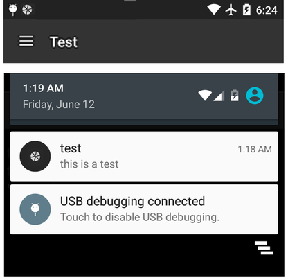
Considerations
- Applicable only to Android devices (landscape and portrait)
- The image must be completely white, optionally with transparency. The background color is taken from the property Primary Color of the Application Theme class.
- The size must be 24x24 dp :
| |
mdpi |
hdpi |
xhdpi |
xxhdpi |
xxxhdpi |
| Notification Icons |
24 px (22 px inset) |
36 px |
48 px |
72 px |
96 px |
The Android Asset Studio tool by Roman Nurik may be useful.
Only for applications running on iPad with Split mode navigation style. It is on the right when the application is being loaded.
Example:
Considerations
- Applicable only to the iPad (landscape and portrait). Different size images have to be created for the various formats.
| |
|
Size (pixels) |
| |
iPad Landscape |
703 x 704 |
| |
iPad Portrait |
768 x 960 |
| |
iPad Retina Landscape |
1406 x 1408 |
| |
iPad Retina Portrait |
1536 x 1920 |
These icons are used in the items of a main Menu object when the value of the Control property is "Tabs".
Example:
- The extension must be *.png and with transparency (alpha channel different of 1).
The transparency automatically enables a view when the tab is selected, different from the view with the unselected tab.
| |
|
1x |
2x |
3x |
| |
iOS
|
25x25 min
48x32 max
|
50x50 min
96x64 max
|
75x75 min
144x96 max
|
| |
Android
|
48x48 (hdpi)
|
-
|
-
|
- There are some images that the iOS framework provides as standard icons for actions and tabs.
See more information here.
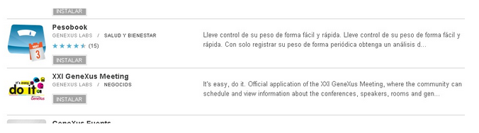
This is the image that represents the application in the market, i.e. Google Play (Android), Apple App Store (iOS).
It will appear on the list and in its detail when found.
This image is not configured in GeneXus. Instead, it is loaded at the time of uploading the application in each marketplace.
Example:
These are mandatory images required for uploading to each store.
In some cases, there are other non-mandatory images (for instance: a promotional graph in Android, appearing when the application is shown on a highlighted section).
There are also screenshots of images that are mostly mandatory.
Considerations for ANDROID - play.google.com
It is the image associated with each option (item) in a Menu object. It is set in the 'Image' property of each Menu Option.
- In run-time, these images are adjusted to an 86x86 size in iPhone and iPad, and to 96x96 in Android. So, if the image used is smaller, it will be 'enlarged' so as to adjust to the preferred sizes.
The iPhone 4, the 3rd generation iPad, and later models, have what is called "Retina Display" which provides better resolution in the same screen size. The resolution of the Retina Display twice as wide and twice as long, compared to the earlier models displays. In the case of the iPhones, the resolution is 320 x 480, while in the case of the iPhone Retina, the resolution is 640 x 960 (double width and double height). For the iPad is 768 x 1024 for the earlier models, and 1536 x 2048 for the Retina iPad models.
What GeneXus does is to copy all images used, and search the most appropriate for the device. In devices with Retina Display, it searches for an image with the same name and suffix "_2x". If GeneXus find it, then it is used. If not, the original one is used, and it is scaled to fit the same space on the screen (turning its view pixeled).
The following table might be useful for those people who design the images of an Android app in terms of sizes and densities.
It is strongly recommended working at MDPI as a baseline and then scale the rest of the images for different sizes/densities.
| |
MDPI
(Baseline) |
HDPI |
XHDPI |
XXHDPI |
XXXHDPI |
| Scale |
1 x |
1.5 x |
2 x |
3 x |
4 x |
| DPI |
~ 160 dpi |
~ 240 dpi |
~ 320 dpi |
~ 480 dpi |
~ 640 dpi |
| App Launcher Icons |
48 px |
72 px |
96 px |
144 px |
192 px |
| Action Bar Icons |
32 px (24 px inset) |
48 px |
64 px |
96 px |
128 px |
| Small / Contextual Icons |
16 px (12 px inset) |
24 px |
32 px |
48 px |
64 px |
| Notification Icons |
24 px (22 px inset) |
36 px |
48 px |
72 px |
96 px |
To quickly and easily generate small icons with the correct settings, Android Asset Studio could be useful.
 Prototyping features and Deployment of applications for Smart Devices