Every Theme object includes the ApplicationBars Theme Class to allow customizing the look & feel of the Application Bar control in Native Mobile Applications.
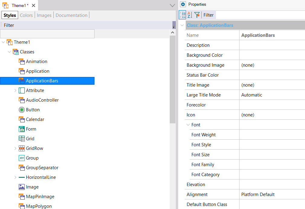
By setting the ApplicationBars Theme Class properties you can define the desired look & feel.
Remember that the ApplicationBars Theme Class is assigned to the Application Bars Class property of Menu, Panel, and Work With objects.
- Background Color - Sets a color for the background of the Bar.
- On iOS 7, the background color has transparency by default. If you want no transparency, set the background color with alpha = 0.
- Background Image - Sets an image for the background of the Bar. See sample.
- Status Bar Color - Sets a color for the background of the Status Bar.
- On Android 5 or greater, you can set the color for the status bar. The Material Design guidelines indicate that "toolbars and larger color blocks should use the primary 500 color, which should be the main color of your app. The status bar should be the darker 700 tint of your primary color".
- On iOS this property is not taken into account.
- Title Image - Sets an image to show instead of the title.
- Icon - Sets an image of the icon shown at the left of the title (only Android). For newer Android versions, its use is not recommended (see Notes section for details).
- Forecolor - Sets a color for the title (if title image is not set).
- Font - Sets font properties for the title (if title image is not set).
- Default Button Class - Button class type that will be used for the buttons on the Application Bar.
- Back Button Class - Button class type that will be used for the back button.
- Back Button Image - Image that will be shown for the back button.
- Back Button Text - Text that will be shown where the back button appears (only Apple).
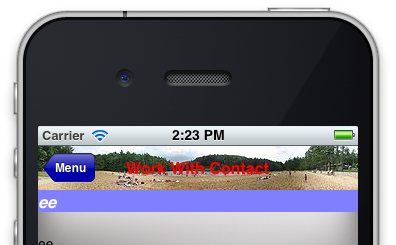
Default: 48 dip
Large portrait: 48 dip
Large portrait mdpi: 56 dip
Large landscape: 40 dip
XLarge: 56 dip
For more information, click here.
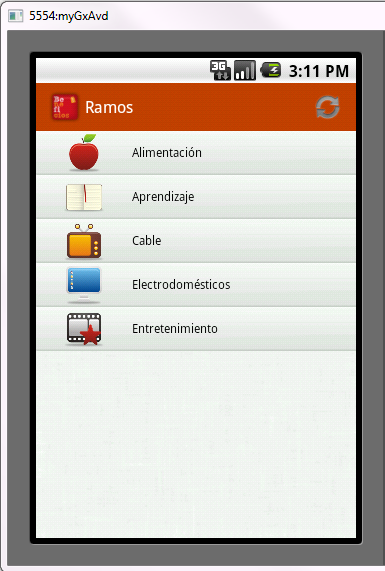
The largest size is 44 dip, except for iPhone landscape, which is 32 dip.
Retina screens have double the pixels at 88 and 64, respectively.
For more information, click here.
- On iOS, the text color of the search box icon for the grid control adopts the Forecolor when it is set at design time.
If the grid is at the top of the panel, it also adopts the background color, checking if the forecolor is dark (if not, it will be set as that).
Otherwise (the grid has other controls above it), it only adopts a minimalist light aspect, without a background color. In this scenario, if the forecolor of the Application Bar class is light, it will adopt it without checking if it is light or not. Maybe it is desirable to preserve the light title on the application bar, and to avoid the described behavior on the search box text, it is recommended to design two Application Bar classes: one for the text of the search box set at design time and another for the title of the application bar set at runtime through the ClientStart event. This action will force to adopt independent Theme Classes for the default search box control and the application bar.
On Android, the text color of the search box depends on the Base Color Scheme property value.
- The use of an icon on the application bar for Android apps is not recommended due to the introduction of Material Design guidelines. The developer guidelines explicitly say:
"In modern Android UIs developers should lean more on a visually distinct color scheme for toolbars than on their application icon. The use of application icon plus title as a standard layout is discouraged on API 21 devices and newer."