It is possible to show the elements of a Grid control horizontally, instead of vertically as usual, by setting the Grid Control Type property to "Horizontal Grid".
You can also control how the elements are displayed by choosing the number of columns and rows you want to show by page.
For example, suppose you want to show 2 columns and 3 rows per page:
| Android |
Apple |
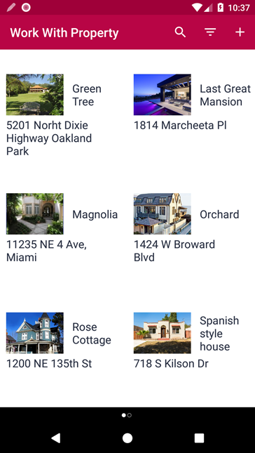 |
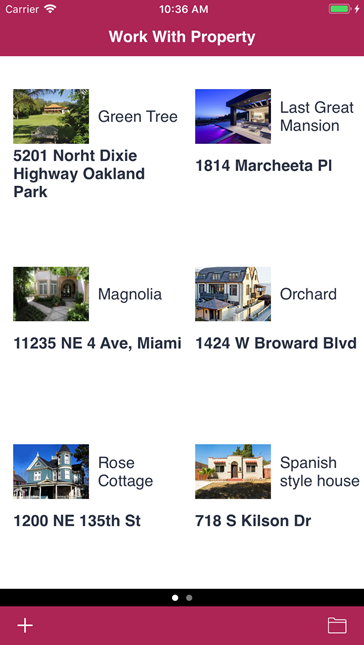 |
To achieve this, follow these steps:
Create the following Transaction object:
Property
{
   PropertyId*
   PropertyName
   PropertyAddress
   PropertyFrontImage
}
Apply the Work With Pattern to it.
Press F5 and add some records.
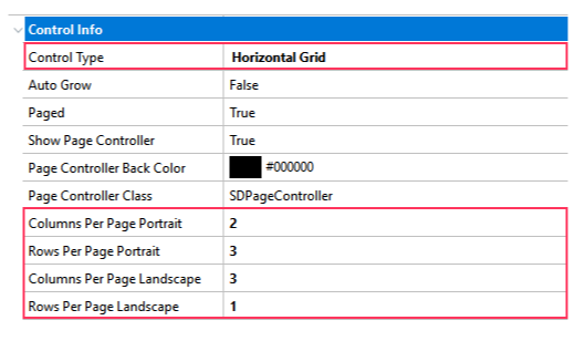
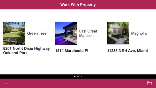
Go to the Work With List Node and select the Grid. Set its Control Type property to "Horizontal Grid" and set the following properties as shown:
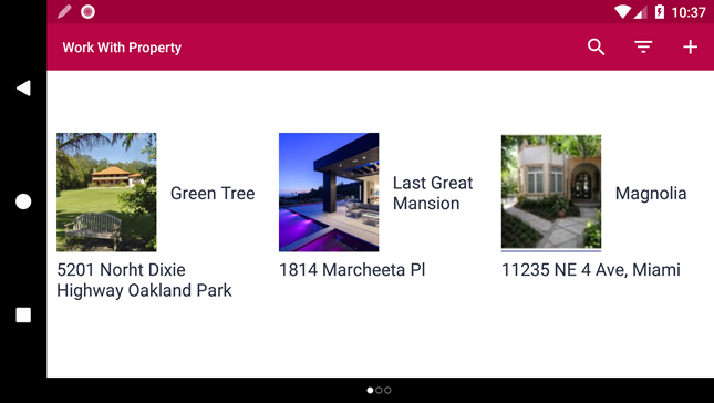
You can see the runtime result in the two images below, depending on the orientation of your device and on the property settings for the number of rows and columns that will be shown by page.
| Android |
Apple |
|
|
| Android |
Apple |
 |
 |
Note: the last image shows a photo taken when the device in portrait mode. You will note the changes in the number of rows and columns shown.