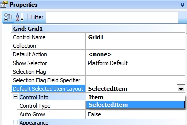
Indicates which layout of a Grid row must be displayed when it is tapped on, to show more or less information, and also to enable new actions only available when the row is selected.
Generators: Android, Apple
Controls: Grid
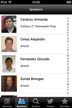
Consider the EventDay application, where there is a WorkWithDevicesSpeakers object with a Grid in which all the event’s speakers are loaded.
Suppose that after selecting a speaker from the grid –by tapping on it–, you want instead of calling the Detail, showing a brief biography of the speaker, and an arrow-shaped image to access further information on the speaker if desired.
| Normal |
|
"Cimas Alejandro" selected |
 |
|
 |
Therefore, you need two layouts for each item or line of the grid: One that is used when the line is not selected, and another one to use when it is selected.
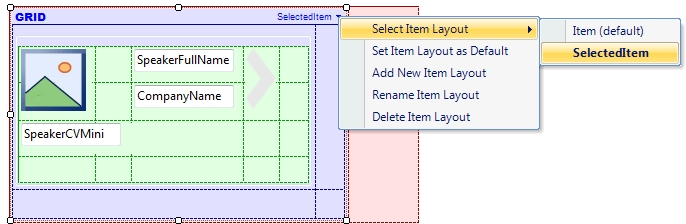
To create a new layout on the Grid of the Speakers List level, you have to:
- Click on the upper right corner of the Grid.
- In the menu that is displayed click on “Add New Item Layout”.
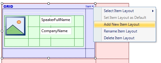
- Enter the name desired for the new Layout (i.e., "SelectedItem"). Note: In this example, the default layout is also renamed as “Item”.
- Organize the Layout as wanted (Add/Move/Remove elements). In this example, a brief biography of the speaker is shown, and an arrow-shaped image to access further information on the speaker if desired.
- Run (F5) and see the result.
Additionally, to continue having access to the Detail level, create the following event on the arrow-shaped image of the SelectedItem layout:
Event Image1.Tap
    WorkWithDevicesSpeaker.Speaker.Detail(SpeakerId)
EndEvent
Consideration: For the Default Selected Item Layout property to work, the Grid’s Default Layout must be different from the layout configured in that property.
This property is available since GeneXus X Evolution 3.
EventDay KB
Multiple Layouts per Row
Work With pattern and Work With object
Work With Pattern Settings
Work With Detail Node
Work With List Node