Defines the behavior of the Grid's rows when they are selected.
| Keep selection while executing | The selection ends when the Default Action ends. |
| Keep until new selection | The selection ends when another selection is made. |
| No selection | The tapped row will not be selected. |
| Platform Default | Default value. Uses the platform default behavior. |
Generators: Android, Apple, Angular
Controls: Grid, Tabular Grid
This property sets the behavior of the Grid's rows when they are selected.
The default value is Platform Default.
Below are described the possible values the property can take.
This property applies only at design time.
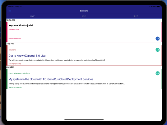
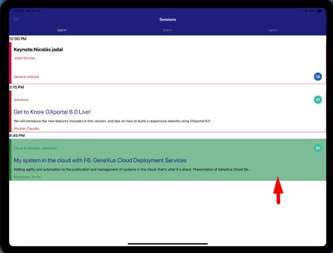
Take as an example the EventDay sample KB and see how different values of the Selection Type property change the behavior of a row when it is selected. For instance, in the Sessions Grid at the List level of the Work With Session:
When using the No Selection value the Highlighted Background color is shown only when the user taps on the row; after that, the row is deselected automatically:
When using the Keep Selection While Executing value, the Highlighted Background color is shown until the Default Action ends:
Grids with Multiple Selection for Native Mobile Applications
Default Selected Item Layout property
Multiple Layouts in Panels