This document shows how to create a Chart. For further information on charts in GXquery, go to GXquery Chart types and Anatomy of a Chart.
In this exercise a graph is required to show sales of airplane tickets in each country. There are two price for tickets: the standard price and the final price, which results from applying a discount to the standard price. The result obtained must be similar to the figure below.
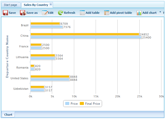
Series are related points of data filled with a single-color weave or filling, which are represented in the output caption. In the example above, the values of each column (Price and Final Price) represent series. In pie graphs, it is not possible to have multiple Series because they show the percentages of every part in relation to the total.
Categories are frequencies of the values to be included in the graph. According to the Chart type – Column or Bar -, categories will be on either one of two axes. The X axe, also known as the horizontal axe, contains the graph categories when it is of the Column type, and the Y axe, known as the vertical axe, applies for the case of Bar-type graphs. In the example of the image above, categories consist of each group of bars that corresponds to each country.
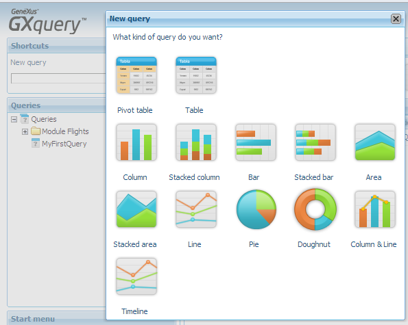
To create a Chart press the New query link in the Shortcuts panel (or the “New chart” link if you are in the “Start page” tab), and then select the Bar icon.
Next you will see a dialog as the one in the image below.
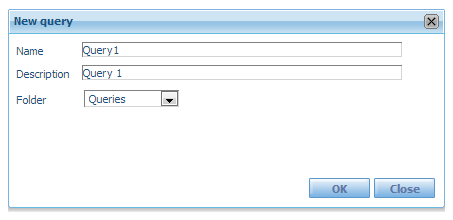
The purpose of this window is to capture the name of the query, an optional description of it, and the name of the folder where it is place (by default, GXquery provides the root node called Queries on which it will place the whole structure of folders and Queries).
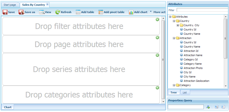
In the Name box write “SalesByCountry” as the name of the query, and press the OK button. You will see a screen divided into areas with labels. It is the bar-type Chart but in its editing state.
To the right you will see a panel with all the attributes of the active metadata that the user may use.
Therefore, …
- Open the node of the Flight file located in the Attributes panel.
- Drag and drop attributes Flight Price and Flight Final Price in the sector of the series (inside we can read “Drop series attributes here”).
- Drag and drop attribute Flight Departure Country Name in the area of categories (inside we can read “Drop categories attributes here”).
Note: From the moment when the attribute is dropped in any of the areas of the Table, it becomes a Query Element.
The image must be similar to the one below.

Press the View button to verify if the result is the one expected. The only differences with the result expected are found in the titles of columns, which we will change.
Press the Edit button to return to the edition status of the Chart and then select the query element Flight Departure Country Name.
Note the Properties panel: Query element. Note that the description also reads Flight Departure Country Name. It is from that property that GXquery takes the label for the column. So, change the description and replace it with “Departure Country Name”. Do the same with query elements Flight Price and Flight Final Price replacing them with Price and Final Price respectively.
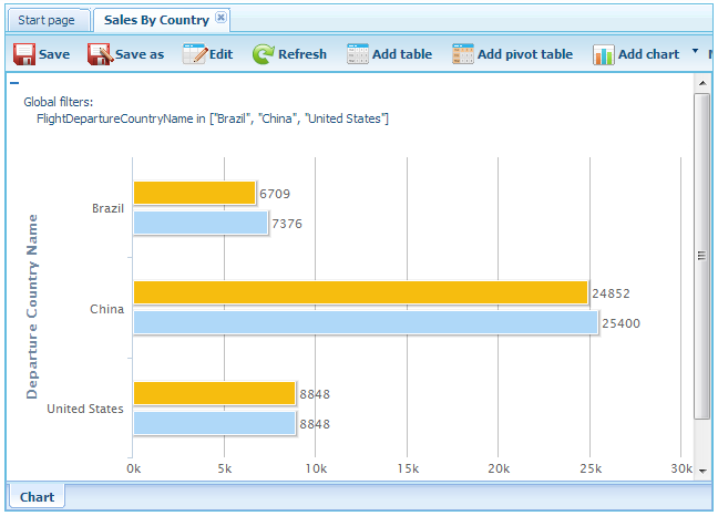
The GXquery Chart also enables the filtering of information to include only what we need. Let’s do the following exercise: suppose we want only to view the records of Brazil, China and the U.S.A. So, …
In Edit mode, drag and drop the Flight Departure Country Name attribute in the filters area (labeled as “Drop filter attributes here”). You will immediately see a window as the one shown below.
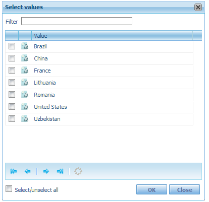
Check the boxes corresponding to Brazil, China and the U.S.A., and press OK to go to the filters window. Then press OK again to return to Edit mode.
Press View. You should view an image similar to the one shown below.