GXquery and the Query Viewer User Control provide three types of charts: Pivot table, Table, and several types of Charts.
When there are attributes and data to chart, the GXquery 4.0 environment offers a toolbar to select the type of chart.
It is very useful when we have a large volume of data that can’t be displayed in a simple table, as well as when we need a quick view of patterns and trends in various ways.
The image below shows a Pivot table at runtime.
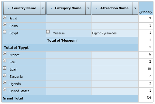
Pivot tables are versatile and useful. They do not only allow managing rows and columns, as simple tables do, but they also allow applying filters in specific areas to obtain other views, moving rows and columns (pivoting), crossing them with hundreds of thousands of data items. Without a tool like this, it would be impossible to graphically navigate them.
Take a look at how the Pivot table is made up: Anatomy of a Pivot table.
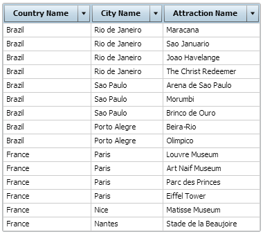
Table charts show a combination of data in rows and columns. One of its key benefits is that any of its values, made up by columns, can be ordered in ascending and descending order. In addition, column positions can be switched with others.
Filters can also be used to refine the data displayed.
The image below shows a Table at runtime.
Basically, they are used to show large numerical data sets that provide quick insight, in only two dimensions, about the large volume of information available and the relationship existing between these different data sets.
GXquery supports several types of charts that make it possible to obtain various views of the same reality.
 |
Column. It shows values and data sets in vertical columns, whose Height values represent the Y axis. These columns are grouped by category, and categories belong to the X axis. |
 |
Stacked Column. It is similar to a Column, but instead of showing data sets in adjacent columns, it shows them in a single stacked column where the column height is the sum of the category values. |
 |
Bar. Bars show values in individual bars, grouped in categories and horizontally arranged. The length of these columns represents the values available, which are shown on the X axis. On the other hand, categories represent the Y axis. |
 |
Stacked Bar. It is similar to a Bar. For each category, it shows the data set values stacked in a single column where the length of the column represents the total value of all the data sets stacked in the column. |
 |
Area. It shows data sets as individual lines and the areas between them are shadowed in different colors. Their values determine the break points in the lines. |
 |
Stacked Area. It shows data sets as individual lines, shading below each one of them up to the following value. The height of the first sets is the sum of the value of each point in the set below it. Additional sets are represented with those values plus the points that represent the values of the sets below it. |
 |
Line. Data is displayed in rows or columns, where the category data is distributed throughout the X axis, and data is vertically displayed in the same axis. They tend to show trends in data at regular intervals such as days, months, years, time units, etc. |
 |
Pie. This chart indicates how data is distributed, showing numerical proportions with lines that create sectors resembling the slices of a pie. |
 |
Doughnut. It shows categories and sets in groups, and values are displayed as slices, where the size of a slice is determined by the value of each set. |
 |
Column & Line. It’s a combination of two other types of charts in a single Column and Line. |
 |
Timeline. It allows charting a long time line and offers features such as zooming and comparing with the previous period or year. |