Time is a measurement that is always included in data analysis; in most cases, it is the essence of the analysis and that’s why it can’t be left out.
The Timeline chart is an example of this because its main purpose is to show how a group of resources are used over time. The Timeline chart allows comparing up to two years.
Of course, for the Timeline chart to work it must have an attribute of Date or DateTime type in the category area. More than one attribute can be added as a series depending on the results to be obtained.
In the following example we will create a Timeline that enables us to compare the purchases made by two customers previously selected by parameters.
First, we create the parameters to select the customers to compare (for further information on how to create parameters, read Filtering information), such as &Customer1 and &Customer2.
Next, we drag the InvoiceAmount attribute to the series area and double click on it; in the Formula tab we type:
Sum (InvoiceAmount) where (CustomerId = &Customer1)
We create another Query Element in the same area and repeat the same formula, but this time we use the parameter &Customer2. We click on View and enter the numbers of the customers we want to compare; for example, 7 and 9. An image similar to the one below will be displayed upon clicking on the All button of the Zoom bar.
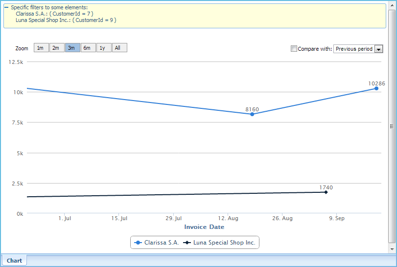
Note the Zoom bar in the upper left area. It enables us to compare periods of one, two, three, six months, one year and all of them.
In the upper right corner there is a check box to enable the combo box labeled “Compare with:” It has two possible values for comparison:
Previous period. If we examine the last three months, this value will chart the three months previous to the current month.
Example: If we’re examining the period from September to November 2013 (three months), we will see the period that goes from June to August 2013.
Previous year. If we’re examining a certain period in 2013, we will see the same period in 2012.
Sometimes it can be hard to view changes over time when the lines are too jagged or crowded. In these cases, we can use the manual zoom to view more details. To do so, click, hold and drag the mouse pointer to the farthest position to examine. Next, release the mouse button and the Timeline will zoom in the selected area.