The Elements component allows the user to view all the existing elements and manage all their properties. These elements are the data fields on the dynamic forms.
The following figure shows the Elements interface:
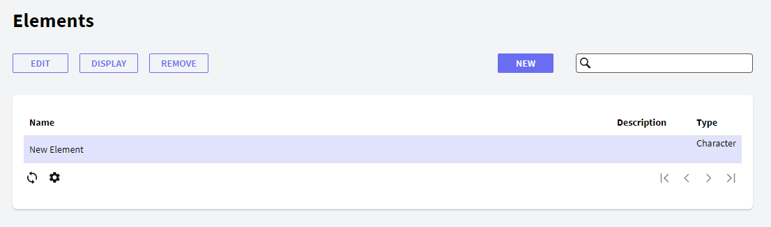
In the following sections, you will find a description of the different components that make up its interface.
The following buttons allow you to perform some actions over the Elements in the grid.
- New: the New button allows the user to create a new element. Users will view the following dialog where they can set the element properties:
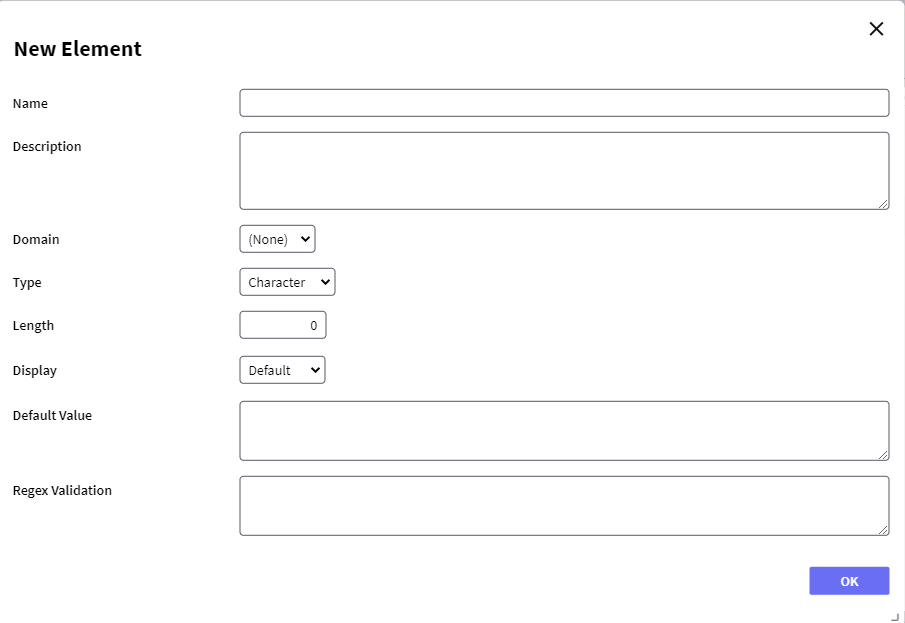
- Name: name of the element—to be used when selecting it from the form.
- Description: description of the element; the description is used in the actual form—when the form is executed.
- Domain: Domain of the element.
- Type: type of the element—inherited from the domain. Possible values are as follows:
- Boolean
- Character
- Date
- DateTime
- Email
- Enum
- Group
- Numeric
- Password
- Upload
- Display: the way the domain must be displayed; in other words, its control—inherited from the domain. Possible values, depending on the type, are as follows:
- None
- Auto Complete
- Combo
- Date no picker
- Default
- In place edit
- Label
- Multi Select
- Radio
- Slider
- Textarea
- Grid
- DSCombo
- Default Value: sets the default value to be used for the element—inherited from the domain.
- Regex Validation: sets a regular expression to be queried when data is inserted in the field—the inserted data must match the pattern. Only available when using Character type.
- Edit: allows editing any property of an existing element.
- Display: displays all the properties of the element.
- Remove: removes/deletes the element.
This grid has the following options:
 It allows selecting the columns that should be visible.
 It allows refreshing the grid.
It is possible to sort some columns by clicking on their title.
This grid consists of the following columns:
- Id: element Id
- Name: element name.
- Description: displays the description of the element.
- Type: type of the element, taken from its Domain.
GXflow Dynamic Forms