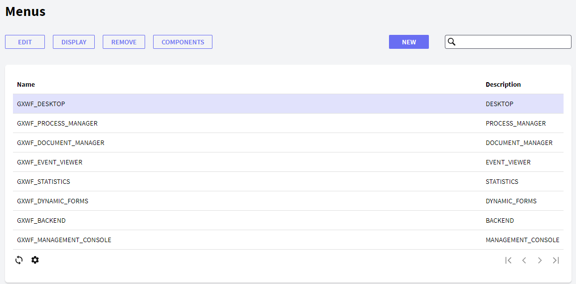
The Menus component allows the user to view all the existing menus and manage all their properties, as well as create new ones. The figure below shows the Menus interface:
In the following sections, you will find the description of the different components.
The following buttons allow you to perform some actions over the Menus in the Grid.
- New: the New button allows the user to create a new menu. The following dialog window will be displayed for the user to set the menu properties:
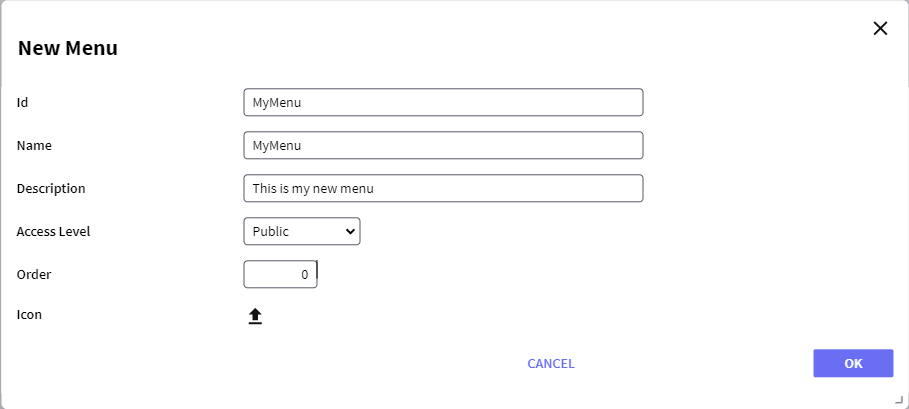
Where:
- Id: a string identifying the menu.
- Name: a string to be used in the tree to identify the menu.
- Description: a string with a description of the menu.
- Access Level: this property is only enabled when not using GeneXus Access Manager (GAM) and sets the level of users for whom this menu will be available; see Access Level property for further details.
The possible values are:
- Public: all roles will be able to use the menu—see/open it.
- Manager: users with GXflow Manager role will be able to use the menu.
- Administrator: only users with GXflow Administrator role will be able to use the menu.
- Order: an integer to set the order in which the menu will be displayed in the tree. A greater number will cause the menu to be displayed at a lower level of the tree.
- Icon: allows adding an icon to the menu.
- Edit: allows editing any property of a menu. This option is not allowed for default menus; the error "This operation is not allowed" will be displayed if used when selecting a default menu.
- Display: displays all the properties of the menu.
- Remove: removes/deletes the menu. This option is not allowed for default menus; the error "This operation is not allowed" will be displayed if used when selecting a default menu.
- Components: allows adding or deleting components from a menu. The user will view the following dialog, where he can add or delete components from a menu:
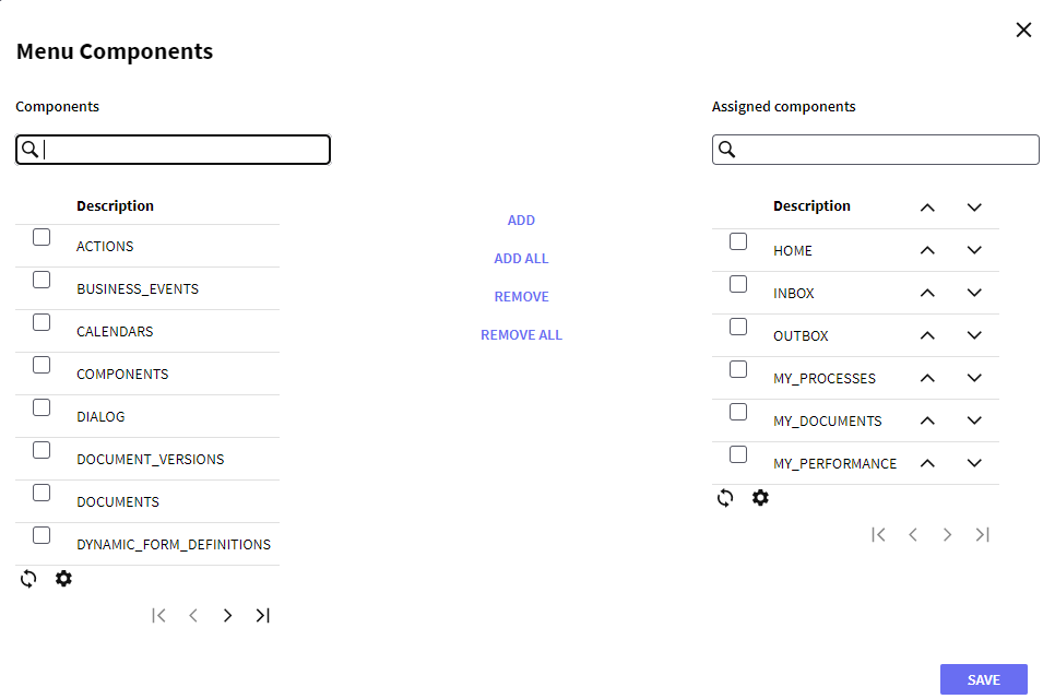
Components can be added or deleted by selecting them from the left grid and pressing the add or remove button. It is also possible to change the order in which the components are displayed by clicking the arrows next to the components.
This grid has the following options:
 It allows selecting the columns wanted to be visible.
 It allows refreshing the Grid.
It is possible to sort some columns by clicking on their title.
This grid consists of the following columns:
- Id: displays the ID property of the menu.
- Description: displays the description of the menu.
- Name: displays the name property of the menu.