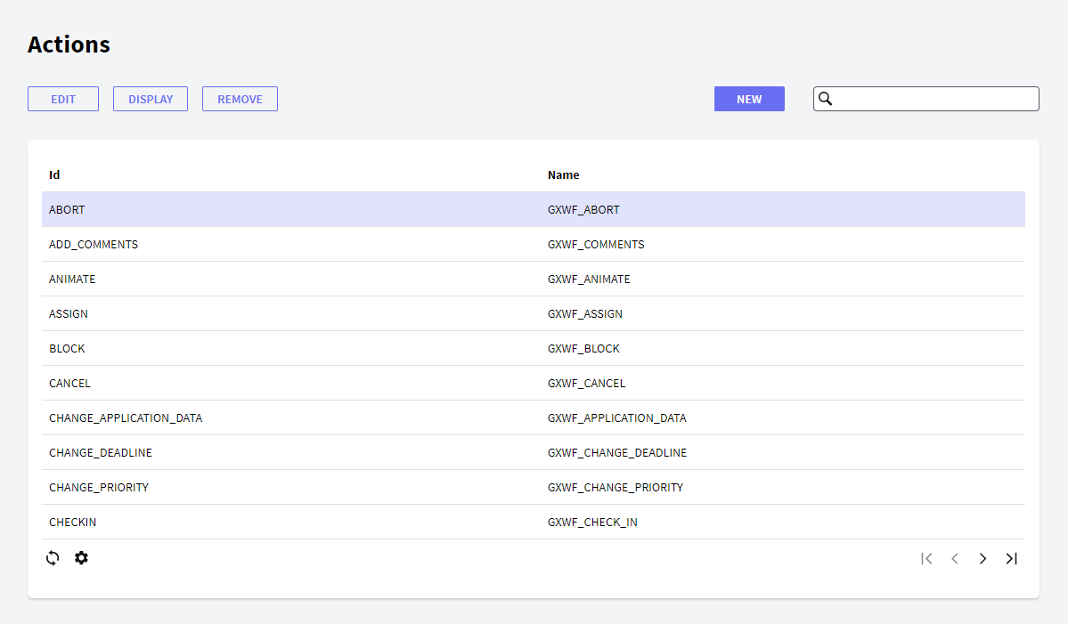
The Actions component allows the user to view all the existing actions and manage all their properties. Actions are buttons that can be available on each component, for example the Inbox component has the "New", "Execute" and "Send" actions—among others. These actions are represented by buttons on the component interface, as shown below:
In the following sections you will find the description of the different components.
The following toolbar buttons allow you to make changes to the Actions in the grid.
- New: the New button allows the user to create a new action. The user will view the following dialog where he can set the action properties:
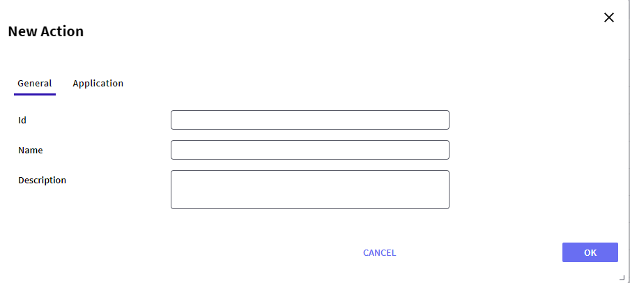
- General tab:
- Id: a string identifying the action.
- Name: a string to be used in the tree to identify the action.
- Description: a string with a description of the action.
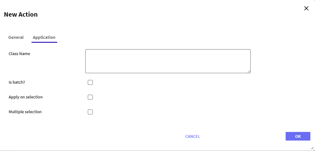
- Application tab:
- Class Name: name of the object to be called when the component is opened. For example, if a Web Panel object named "SendEmail" is to be called, the "SendEmail" string is set to the Object property.
- Is batch?: whether the action is batch. If the action is not set as batch it will be called as a pop up window.
- Apply on selection: whether the action applies over a selection. If this property is enabled, the object assigned in the Class Name property will be called using a string as parameter. This string will contain the ID of the item selected in the row.
- Multiple selection: whether the action applies over a multiple selection. If this property is enabled the object assigned in the Class Name property will be called using a string as parameter. The string will contain the IDs of the items selected in the grid, separated by a comma—','.
- Edit: allows editing any property of an action. This option is not allowed for default actions; the error "This operation is not allowed" will be displayed if used when selecting a default action.
- Display: displays all the properties of the action.
- Remove: removes/deletes the action. This option is not allowed for default actions; the error "This operation is not allowed" will be displayed if used when selecting a default action.
This grid has the following options:
 It allows selecting the columns wanted to be visible.
 It allows refreshing the grid.
It is possible to sort some columns by clicking on their title.
This grid consists of the following columns:
- Id: displays the ID property of the action.
- Name: displays the name property of the action.
- Description: displays the description of the action.