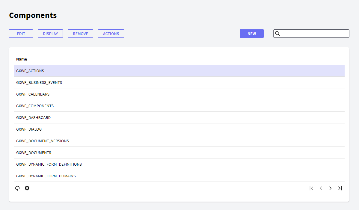
The Components component allows the user to view all the existing components and manage all their properties. These components are the options available on the menus, for example, the Inbox component belonging to the Desktop menu.
The figure below shows the Components interface:
 In the following sections you will find descriptions of the different components that make up this interface.
The following buttons allow you to perform some actions over the Components in the grid.
- New: the New button allows the user to create a new component. The user will view the following dialog where he can set the component properties:
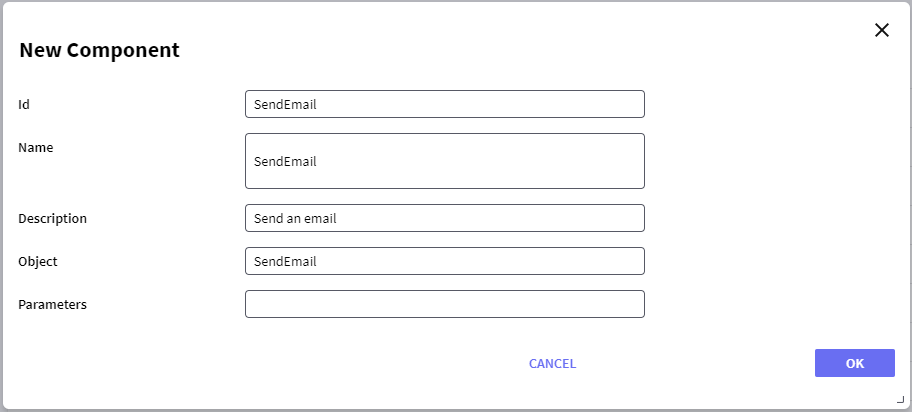
Where:
- Id: a string identifying the component.
- Name: a string to be used in the tree to identify the component.
- Description: a string with a description of the component.
- Object: the name of the object to be called when the component is opened. For example, if a Web Panel object named "SendEmail" is to be called, the string "SendEmail" is set to the Object property.
- Parameters: a string with the set of parameters that has to be used.
- Edit: allows editing any property of a component. This option is not allowed for default components; the error "This operation is not allowed" will be displayed if used when selecting a default component.
- Display: displays all the properties of the component.
- Remove: removes/deletes the component. This option is not allowed for default components; the error "This operation is not allowed" will be displayed if used when selecting a default component.
- Actions: allows adding or deleting actions from a component. The user will view the following dialog where he can add or delete actions from a component:
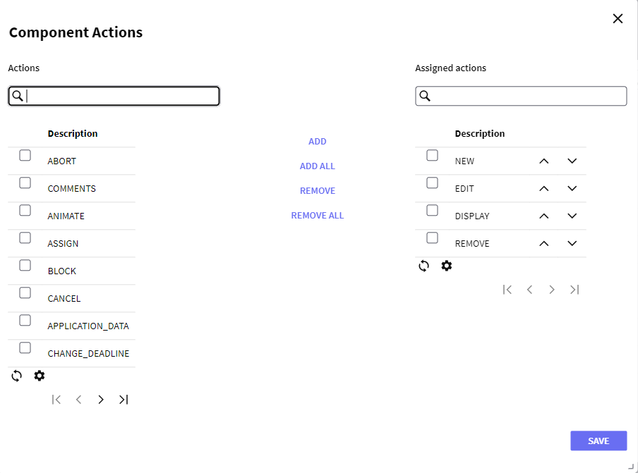
Actions can be added or deleted by selecting them from the left grid and pressing the add or remove button. It is also possible to change the order in which the actions are displayed by clicking the arrows next to the actions.
It is also possible to change the order in which the componentes are displayed by clicking the arrows next to the components.
 It allows selecting the columns wanted to be visible.
 It allows refreshing the grid.
It is possible to sort some columns by clicking on their title.
This grid consists of the following columns:
- Id: displays the ID property of the component.
- Name: displays the name property of the component.
- Description: displays the description of the component.